Café Typô
A blog on the art of typography
  • fr
  • en
    • Blog
    • Projects
    • About

    Typographic space: invisible, yet essential

    Type tips 3 minutes

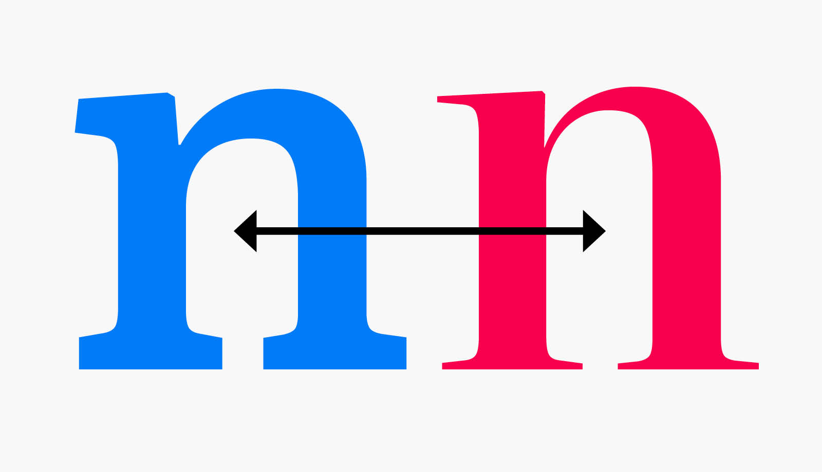
    When discussing typography, we instinctively focus on letters, curves, serifs—anything visible. But some of the most decisive typographic signs are invisible. The typographic space, a full absence, sets the rhythm, articulates content, and sometimes saves the layout.In this article, we’ll explore its main variations, their use across software and the web, and address some lexical… read more

    Espace typographique espace typo espace insécable espace fine

    Font, typeface, typo… when English and French meet in typography

    Terminology 4 minutes

    In the world of graphic design, English dominates the conversation. But some of its most common technical terms are actually born from French. Some terms crossed the Channel centuries ago and never looked back. Others, like font, return to us, transformed. This article explores the back-and-forth exchange between two of typography’s richest linguistic traditions.

    When English and French Meet in Typography - Font, Typeface, Typo, Roman

    Munegascu: A typeface for writing the Monégasque language

    News 4 minutes

    The Munegascu project takes up the challenge of integrating an unlisted accent in a character, and making the writing of the Monegasque language easy thanks to an unprecedented OpenType trick. Compatible and universal, this character celebrates the link between typography and cultural heritage, contributing to the revitalization of a rich but threatened language.

    An essential quality of typography reappears after 50 years of obscurity (the optical size)

    Type tips 5 minutes

    In the era of lead type, a typeface was always available in different design variations. The transition to digital had abolished this practice, which was nevertheless fundamental. It is now making a comeback with variable fonts and the concept of optical sizes.

    The Legacy of Twen – An Interview with Serge Ricco

    Interviews 14 minutes

    Serge Ricco is the renowned art director who shaped Télérama and L’Obs for many years. In his latest book, he revives the revolutionary spirit of Twen and reveals why this German magazine from the 60s continues to inspire today’s art directors. This interview also delves into the references and vision of this insatiable magazine lover.

    History of monetary symbols: the pound sterling (3)

    Type tips 5 minutes

    I initially thought of writing just three brief paragraphs about this well-known symbol. However, the writing of this article took the form of a genuine little investigation. Let’s delve into the history of the pound sterling.

    My typographic cleaning routine of a text

    Type tips 3 minutes

    We’re not discussing a morning routine or a makeup routine here, but rather a typographic cleaning routine. It’s about how to clean up a text typographically before finalizing its layout.

    History of currency symbols: the Euro (2)

    Type tips 4 minutes

    The euro was born in 1996 and entered our lives in 2002. Its symbol is now a familiar part of our world, but its implementation was not as straightforward as one might imagine.

    History of currency symbols: the Dollar (1)

    Type tips 2 minutes

    Currency symbols are universal; they accompany us in all our transactions and find their way into all the writings of the world. However, their history sometimes eludes us. Let’s start this series by looking at the history of the Dollar.

    Signes monétaires Dollar

    The making of the 2022 Royaumont Festival poster

    News 1 minute

    As every year since 2015, the poster for the Royaumont Festival was created thanks to the combined efforts of Bruno Bernard, artistic director, Quentin Bertoux, photographer and Igor Szabason, public and communication director of the Foundation.

    Posts navigation

    Older posts

    Categories

    • Interviews
    • News
    • Terminology
    • Type tips

    Alfab Type Foundry

    Typefaces steeped in both contemporary and heritage values

    Adso Apostrophe Art direction ATypI BAT Chaumont Education Excoffon Graphic design Lecture Letterpress London Magazine Monetary signs OpenType Orthotypography Photography Publication Quotes Rencontres de Lure Royaumont space Type terms Variable fonts Workshop

    Subscribe to the blog

    Receive content once a month to consolidate your mastery of typography

    loader

    Email Address*

    ©2025 Café Typô

    • Legal notice