
The Legacy of Twen – An Interview with Serge Ricco
Serge Ricco is the renowned art director who shaped Télérama and L’Obs for many years. In his latest book, he revives the revolutionary spirit of Twen and reveals why this German magazine from the 60s continues to inspire today’s art directors. This interview also delves into the references and vision of this insatiable magazine lover.
![twen [1959-1971], Bureau Brut publishing](https://brunobernard.com/app/uploads/2024/05/20-Twen-01-01.jpg)
Bruno Bernard – Before talking about the book, let’s talk a bit about you. Can you summarize your career?
Serge Ricco – Let’s say “magazine lover”. If there’s one guiding principle, it’s that: the love for newspapers and magazines. After graduating from École Estienne, I was one of the few who wanted to enter a magazine, while most were heading to ad agencies or communication agencies. But it was still a time when there were no computers in newsrooms.
I started at Télérama magazine. I stayed there for 20 years, which is quite long. I think I saw every corner of the house. After a while, I was offered to redesign Le Nouvel Observateur. I needed to see other things, and I don’t regret it. Because for me, the first quality of an art director in the magazine press is the same as that of a journalist: it’s being curious. And the second is loving to transmit information.
When I started at Télérama, I was lucky to work with an English studio that has since disappeared, called CDT. We worked with Nicolas Thirkell, who was truly a great creative director. He had done The Observer, The Independent, all the major English newspapers multiple times. He brought good graphic foundations to Télérama, which remain even today. It was in the early 90s. With him, I learned a lot. The first thing he advised me was to go down to the archives. To imagine the future, you always need to know where you come from.
“The first thing is to go down to the archives.”
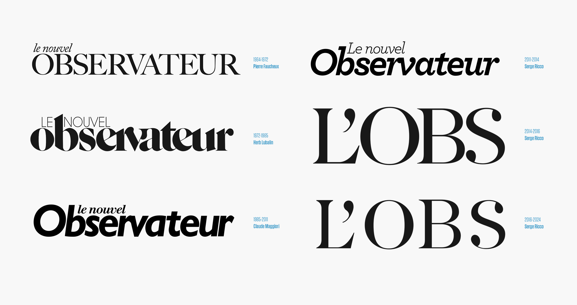
For L’Obs, I did the same thing. And I realized, after a bit of research, that the person who created the first logo was Pierre Faucheux. And a year later, the covers were redesigned by Robert Delpire, who was a close friend of Claude Perdriel and founder of the Observateur. In the 70s, Delpire asked Herb Lubalin, who was no small typographer, to redesign the famous logo of the 70s, with a sort of redesigned Caslon. I wondered how they could have forgotten all this graphic framework. My job was to take a bit of all that to reinvent the DNA of L’Obs in 2014.
And for the past two years, I’ve left L’Obs and founded my studio called Ricco&Co. This allows me to work for various magazines that need an editorial vision, not just purely aesthetic. I always emphasize my perspective on the content, as it is the content that always defines the form.
Alongside that, I write for Eye magazine. I did my first interview with Peter Knapp, who is a friend and a spiritual father of art direction, who will always be with me. And I’m also developing things I never could before, like graphic design for cinema and television.
Your new book is about the magazine Twen. To start, what does the word Twen mean?
It comes from the English twenty. It’s not a word, neither a German word nor a word that actually exists. It’s a sort of creation to say that it was aimed at 20-year-olds, thus the post-World War II generation at that time.
![twen [1959-1971], Bureau Brut publishing](https://brunobernard.com/app/uploads/2024/05/124-Twen.jpg)
How did this book come about? Who initiated it?
It was Julia Joffre who initiated the book. She is one of the associates of Bureau Brut, which started as a foundry and then developed a publishing section. They had already released two books, one on Garamond, written by Stéphane Darricau, whom I knew from École Estienne. He used to have me speak in his classes. Stéphane knew that I had been collecting Twen for years, and they offered me to participate in this adventure.
An archive that stays with someone has no interest to me. The interest is to pass it on. As they say: “when a man dies, a library burns.” I hope my books will outlive me. As for Twen, it was the magazine that I think influenced all the art directors of the time, and still those of today. For example, Francesco Franchi, whenever he gives a lecture, he talks about Twen.
![twen [1959-1971], Bureau Brut publishing](https://brunobernard.com/app/uploads/2024/05/28-Twen.jpg)
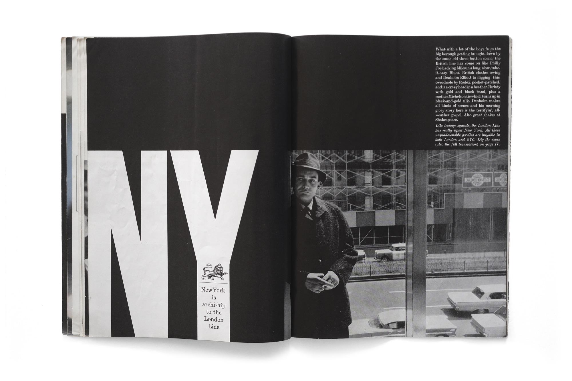
There were 4-5 magazines that were important at that time, and the 60s, to me, are the golden age of the magazine. What’s interesting in Twen is that an art director without real artistic training, Willy Fleckhaus, managed in ten years to establish the fundamentals of a good magazine. The use of typography, the image, and this in a journalistic way, but still very graphic.
“An archive that stays with someone has no interest to me. The interest is to pass it on.”
I interviewed Harri Peccinotti, who was another great art director of the time. He created Nova Magazine in England, and substituted for Willy Fleckhaus, the art director of Twen, during summers. He said, “I never spoke German, but I understood this magazine.”
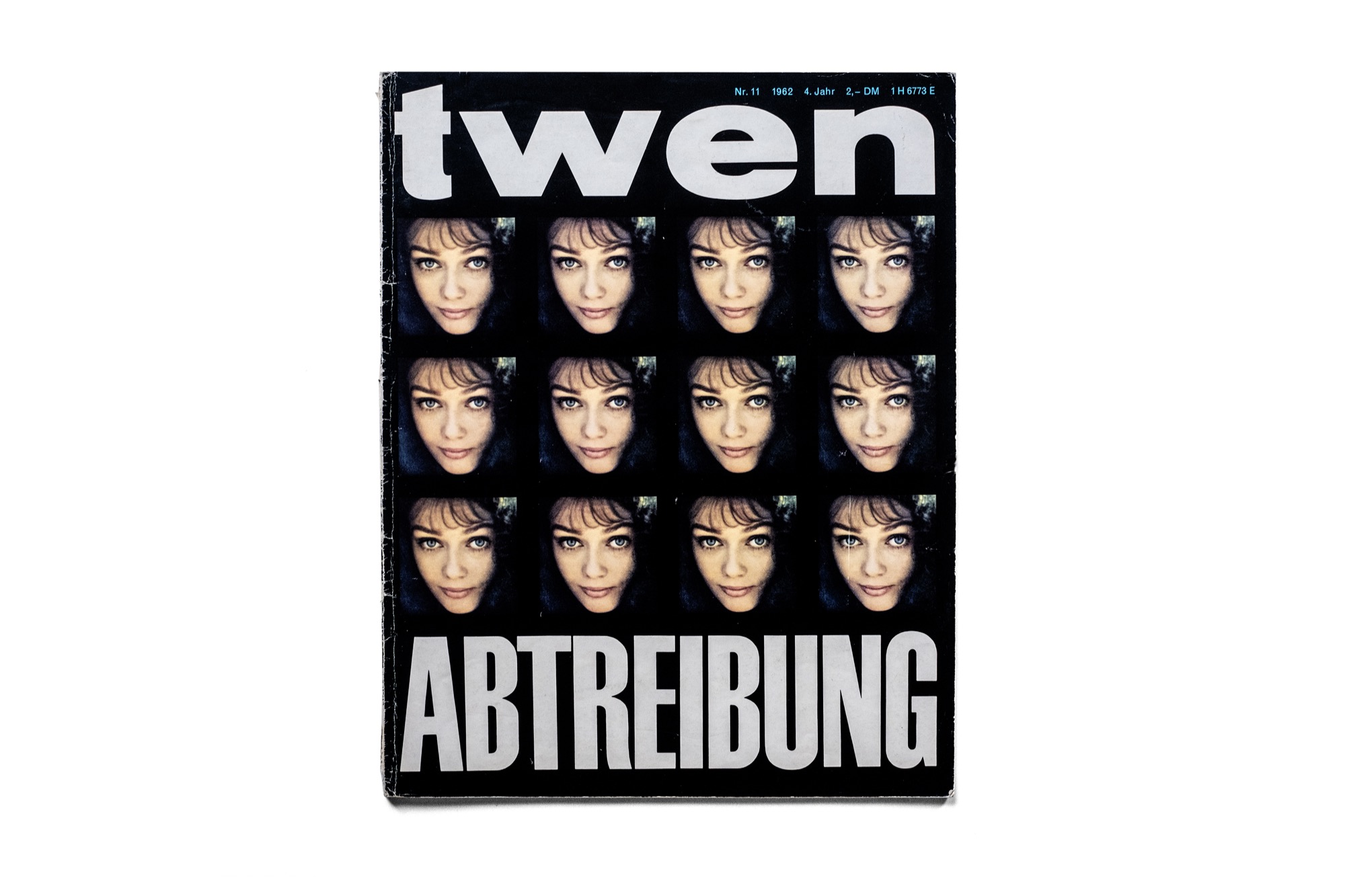
I bought a lot of Twen initially, and I didn’t understand what it meant. In fact, oddly, in the first issue I bought, when I was still at École Estienne, the word “abortion” was on the cover in German. It was much later that I realized that the magazine I worked for was the one that published the manifesto of the 343 for abortion.
In this archiving process, I realize that things are always connected, and that if you love something, it’s not by chance. It’s because there is often someone behind it that you love. There’s truly a principle like a spider web. The search for the archive is like a police investigation, actually. We’re not looking for a culprit, but we’re looking for why we do it.
You talk in the book about your emotion upon discovering this first issue of Twen, and you say it will be the source of your fundamentals as an art director of magazines. What are your other fundamentals?
Initially, of course, there is the base we learn at school. But the part after school, I think, has been even more important. What’s quite interesting today is that there are many art directors I discover through my research, which our professors didn’t teach us.
For example, Alexey Brodovitch. We never say that behind Brodovitch, there was Lillian Bassman. She was the art director of Junior Bazaar, who did the supplements for children. These images are always shown, but it’s not Brodovitch who made them; it’s Lillian Bassman, who was his assistant. There are many such people I discover.
“The eye has to travel.”
And the other part that interests me in my archival research, and which constitutes, let’s say, my mental construction base as an art director, is immigration. That is to say, if there were no Hitler, there would not be the greatest newspapers of the 20th century. Most of the time, it’s Jews who were forced to leave France or Europe.
![twen [1959-1971], Bureau Brut publishing](https://brunobernard.com/app/uploads/2024/05/76-Twen.jpg)
For example, Hélène Lazareff created Elle in 1945 when she returned to France. Pierre and Hélène Lazareff left at the beginning of the war for New York, and she found herself with Brodovitch at Harper’s Bazaar. And she came back with the idea of Elle.
It’s a slogan that Diana Vreeland, the great editor-in-chief of Harper’s Bazaar, had: “the eye has to travel.” And that, I think, is the most important thing. Even more today, when we can travel from our seat. At the time, you had to move to find ideas, and the act of making them travel brought something new to another country.
In the small temple of great art directors I venerate, there’s obviously Willy Fleckhaus first, and there’s another gentleman born 100 kilometers from where Willy Fleckhaus was born: Tom Wolsey, the art director of Town magazine. He is as important as Willy, who was also German and Jewish, and who had to emigrate to England at the age of 12-13 to escape Nazism. There are many such people.
In my other part, there are obviously the Swiss and Peter Knapp.
So with Peter Knapp and Elle, Willy Fleckhaus and Twen, Harry Peccinotti and Nova, Tom Wolsey and Town… we’re doing pretty well. They did a big part of the magazine culture.
“He fights with his typography, he fights with words.”
In fact, I talk about the fundamentals of this profession as one talks about the fundamentals of sports. There are things that work in a sport, and for graphic design, it’s the same. Sometimes you can’t necessarily explain it, but you know that such a thing works, and such another thing doesn’t. You can put it in every way, it’s like that.
In Twen, each issue brings different layouts, an unapologetic approach to photography. That is to say, you dive into it, reframe it, play with it. It’s like a boxing match. He fights with his images, he fights with his typography, he fights with words. In each issue, we are spectators of a part of the match, in a way.
![twen [1959-1971], Bureau Brut publishing](https://brunobernard.com/app/uploads/2024/05/34-Twen.jpg)
Would you say that to be a good art director, you must first have things to say about the world?
The driving force is journalism, which is why I always prioritize meaning and started writing articles myself. If an art director is not interested in the idea of information and is merely a form-maker, you really need an editor-in-chief with a good image culture for it to work. If one of the two doesn’t understand the other’s job, it won’t create an intelligent magazine, in my opinion.
A good example is Esquire with George Lois and Harold Hayes. Lois was a great art director but came from advertising, not journalism. Harold Hayes, on the other hand, was a great editorial director who did something amazing. He was hired by Esquire to be the editorial director and told his boss he wanted to spend another year at university. And his boss agreed.
So at university, he found all these great journalists: Gloria Steinem, all the people who would create new journalism. But if he hadn’t had the idea to say, “I don’t feel ready yet to lead an editorial team like this, I need a bit more learning,” new journalism wouldn’t exist!
“When the art director and the editorial director get along like thieves.”
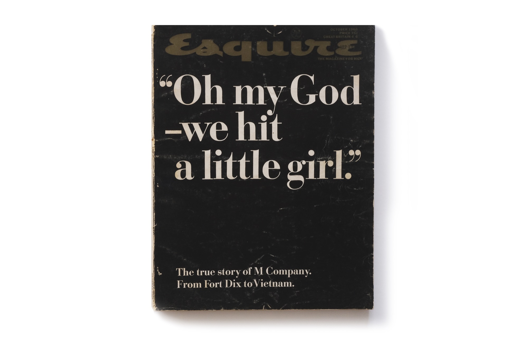
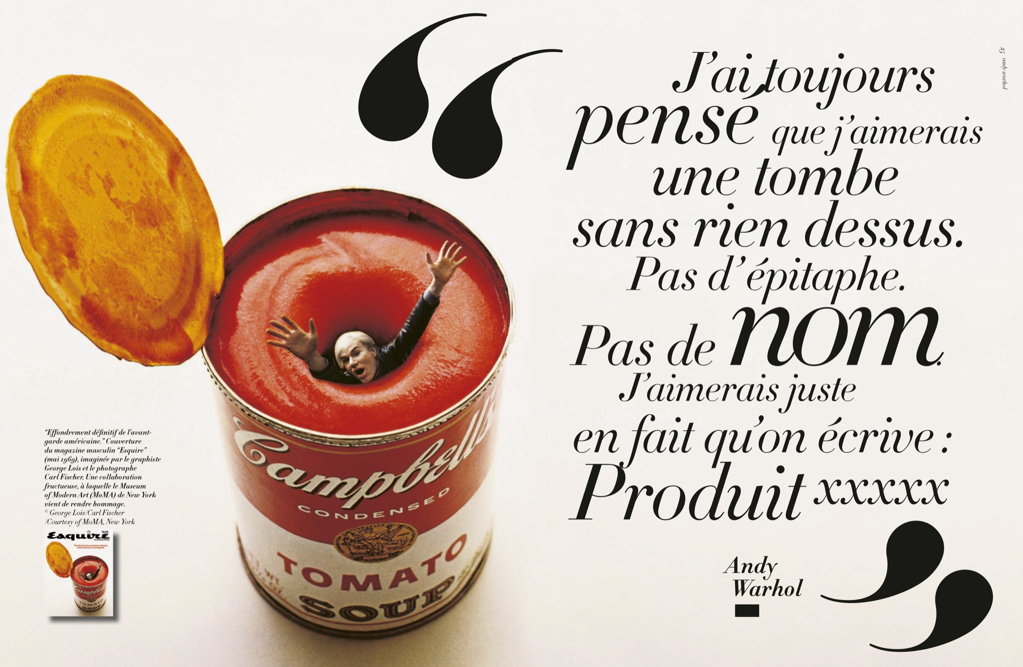
So all these things are connected. And for me, when I was a student, Esquire covers were the best. The one with Andy Warhol drowning in his soup, the one on Vietnam with “Oh my God – we hit a Little Girl” —just typography on a black background— that many people have copied or reinterpreted.
What’s interesting is that this man never set foot in Esquire’s newsroom; he had lunch every month with Harold Hayes, who gave him the summary of the issue, and he chose the subject that interested him. And he made the cover. For the first cover, he depicted a boxer lying on a ring, and like a good advertiser, he told Harold Hayes, “You have a 50/50 chance of flopping with this cover.”
What he didn’t know was that at the time, Harold Hayes had put his resignation on the line if they didn’t accept George Lois’s covers. And for ten years, they managed to create the best covers in the world…
In the book on George Lois’s covers, you see them arm in arm, and I always say, “A good magazine is when the art director and the editorial director get along like thieves.” If one of the two is not good, it can’t work; it will never create a great magazine. It’s not about the content here and the form there. It’s a dialogue that must be constant.
One unique thing about the magazine world is the double page. There’s magic in this dialogue between the right page and the left page. What do you think about the shift of print titles to digital formats, where, by nature, the double page no longer exists?
A few years ago, I gave a conference in England, and I used this analogy: for me, print magazines remain stereo, and the smartphone is still mono. And that’s still the case, actually. You can do good things in mono or stereo, no problem. I compared paper to vinyl. I never threw away my vinyl records, even though in the 80s-90s, we were told to throw everything away with the arrival of CDs.
Today we have foldable smartphones, but it’s just so they fit in your pocket! We still haven’t understood the interesting ping-pong between the left page and the right page. It’s the same ping-pong that’s interesting between words and images.
![twen [1959-1971], Bureau Brut publishing](https://brunobernard.com/app/uploads/2024/05/126-Twen.jpg)
We have two arms and two eyes. We have one heart and one brain, but still, each organ is divided into two. And that’s what we haven’t yet understood in these smartphones, which are made for Cyclops! A magazine version for the iPad isn’t practical; we don’t understand the flow, we don’t know how to go back…
Already, in a magazine, half the people start at the beginning, half start at the end. It’s always like that. The English have internalized this by talking about the BOB (back of the book). They work the BOB. In France, we have a very pedagogical culture, meaning we put the best at the beginning and the less good at the end. They always think you enter from the front and the back of the magazine. The back should be as good as the beginning.
Finally, can you say a word about typography in Twen? How do you appreciate Fleckhaus’s use of typography?
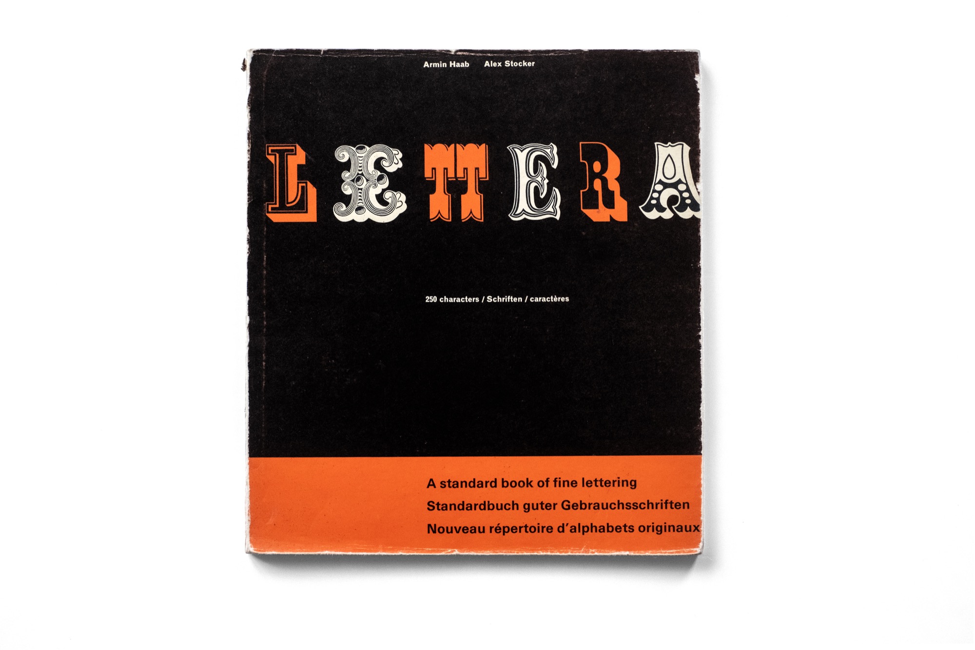
The Schmalfette Grotesk, the headline typeface, comes from Lettera, which was a bit like the Font In Use of the time, in four volumes. When I showed the book to Peter Knapp, for him, it was a Proust’s madeleine. They all had this book, they all had this desire to use Schmalfette Grotesk. But no foundry had published this typeface, so they made typos and redid it by hand.
This typeface is somewhat like Helvetica. It is quite neutral; it doesn’t have a distinct personality. And maybe that’s why it’s interesting; that’s why Fleckhaus could express himself. It wasn’t the typeface’s personality that made it strong; it was how he used it: in large sizes, in small sizes, how he cropped it… He was able to define with this typeface, over the first five years, the entire language, the entire grammar of this magazine. With black background covers, which is usually a no-go.
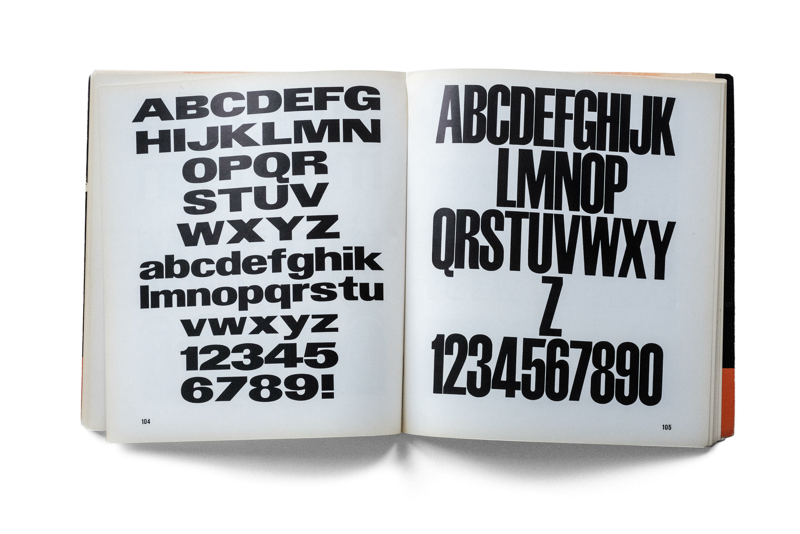
The layout of Twen gradually became infested with new, much more expressive typefaces, like Windsor, the one used in Nova. The typography became more expressive through its form rather than through its use.
The magazine was born in 1959 and died in 1971. It was bought several times, and after the last acquisition, the shareholder fired Fleckhaus. So for the last four covers, he was no longer there. They are white background covers. And then it stops.
They tried to revive it in the 1980s. But a magazine that is dead, there’s no point in trying to resurrect it. It’s not a good idea, I think.
“Magazines are like human beings.”
At the time, Daniel Filippacchi launched Jazz Magazine, and its art director was Régis Pagniez. He was a fan of Twen. They used the same little trumpet, the same illuminations… they were all fans of Twen. Even Fleckhaus used to visit Régis in Paris; there was a sort of emulation between them.
Daniel Filippacchi gives the image I find most interesting about the idea of a magazine: magazines are like human beings. They are born, they live, and they die…
![twen [1959-1971], Bureau Brut publishing](https://brunobernard.com/app/uploads/2024/05/01-Twen.jpg)
A big thank you to Serge Ricco for all the photos illustrating this article.
twen [1959-1971] by Hans-Michael Koetzle, Serge Ricco and Stéphane Darricau. Bureau Brut publishing.

Comments