
My typographic cleaning routine of a text
We’re not discussing a morning routine or a makeup routine here, but rather a typographic cleaning routine. It’s about how to clean up a text typographically before finalizing its layout.

Typography is much more than simply choosing fonts. It’s the art of mastering every detail of the text to achieve a smooth and aesthetic result. Here, I share my method for aligning text with typographic standards to enhance your layouts.
Please note that I don’t claim to be exhaustive. You might have other tricks—or better ones. If so, feel free to add them in the comments below.
Double spaces
Let’s start with the classic: double spaces. They’re almost inevitable errors when typing. They’re subtle but disrupt the text’s appearance. Replace them with single spaces using find-and-replace throughout the document. Repeat this as needed until there are no more double spaces.
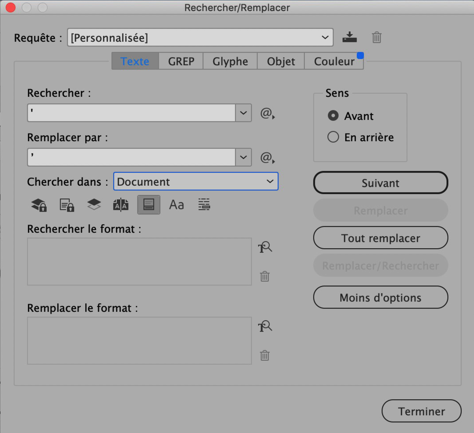
Apostrophes
Typewriter apostrophes aren’t suitable for text. I’ve already written a whole article about this. Perform successive “Replace-Find” to check each instance (and make sure not to change typewriter apostrophes to curly quotation marks when they are needed for inches indicators, for example). Your text will gain elegance.
Spaces around punctuation marks
The french version of this paragraph was the big part of the article. Indeed in French, most punctuation marks are preceded or followed by a space: full space, half space, non-breakable space, you name it. As an english-speaking graphic designer you are safe from this nightmare. But if you were going to put some French text in your mockup, you might want to check out some of my tips on that.
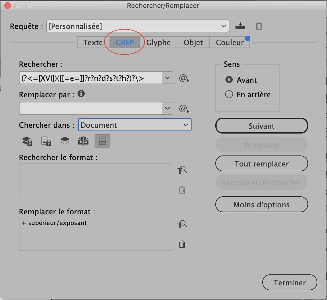
Ordinals (XVIIIth, 1st, 3rd etc.)
This involves superscripting the abbreviations of the ordinal indicators. We will do it in two steps: first the Roman numerals and then the Arabic numerals.
Grep Mode.
Find: (?<=[XVI])([[=e=]]?r?n?d?s?t?h?)?>
Replace: Leave the field blank but format it as “superior/exponent.” It might be tempting to apply a character style, but it could conflict with an already applied style in the sentence, so I’d advise against it.
Do a Replace All… unless your text contains exceptional formulas that could cause confusion. In that case, prefer successive Replace/Find actions to check each case.
Then do the same with:
Find: (?<=[\d])([[=e=]]?r?n?d?s?t?h?)?>
By the way… whether ordinals should be set on the baseline or as superscripts in English is not my concern, as a French designer. But it seems that the use of setting them as superscripts is the most historical. You decide!
And voilà! With this cleaning routine, a once tedious task becomes easy. It’s especially imperative in typography, as beauty lies in the details.

Comments
Great advice. I’d read your article in French, too; I had to work in a project in French and had to learn about French punctuation.
I’d add that in Microsoft Word, and I’m sure in InDesign too, finding and replacing quotes and apostrophes while having the “Smart quotes” option turned on makes all the quotes and apostrophes curly. Maybe, in that case, we should check for any that shouldn’t be an apostrophe, like feet and inches indicators.
But of course, you are absolutely right. In French there are no units of measurement symbolized by apostrophes, but in English there are. Therefore, this manipulation must be done on a case-by-case basis and not by “Replace all”. I will correct the article immediately. Thank you very much for your comment!