
History of currency symbols: the Euro (2)
The euro was born in 1996 and entered our lives in 2002. Its symbol is now a familiar part of our world, but its implementation was not as straightforward as one might imagine.
The question of an appropriate currency symbol arose as soon as the idea of creating this common currency came into play. An ISO standard was established, and the keyboards of all European countries were adapted to accommodate the new symbol. This process took a few years. As for the design of the symbol, it was the subject of internal research.
The euro, a technocrat’s triumph
Around thirty projects are said to have been created before the final choice was made. However, none of them were revealed to the public, and the names of their creators remained undisclosed. It seems that the Belgian Alain Billiet may have been responsible for the creation of the symbol validated by the commission at that time. But another designer, the German Arthur Eisenmenger, claimed authorship. He had long been in charge of the graphics for the European Commission and had supposedly proposed a similar symbol to represent Europe itself twenty years earlier, which was not adopted at the time but resurfaced for the new currency, even though its creator had already retired.
A european standard?
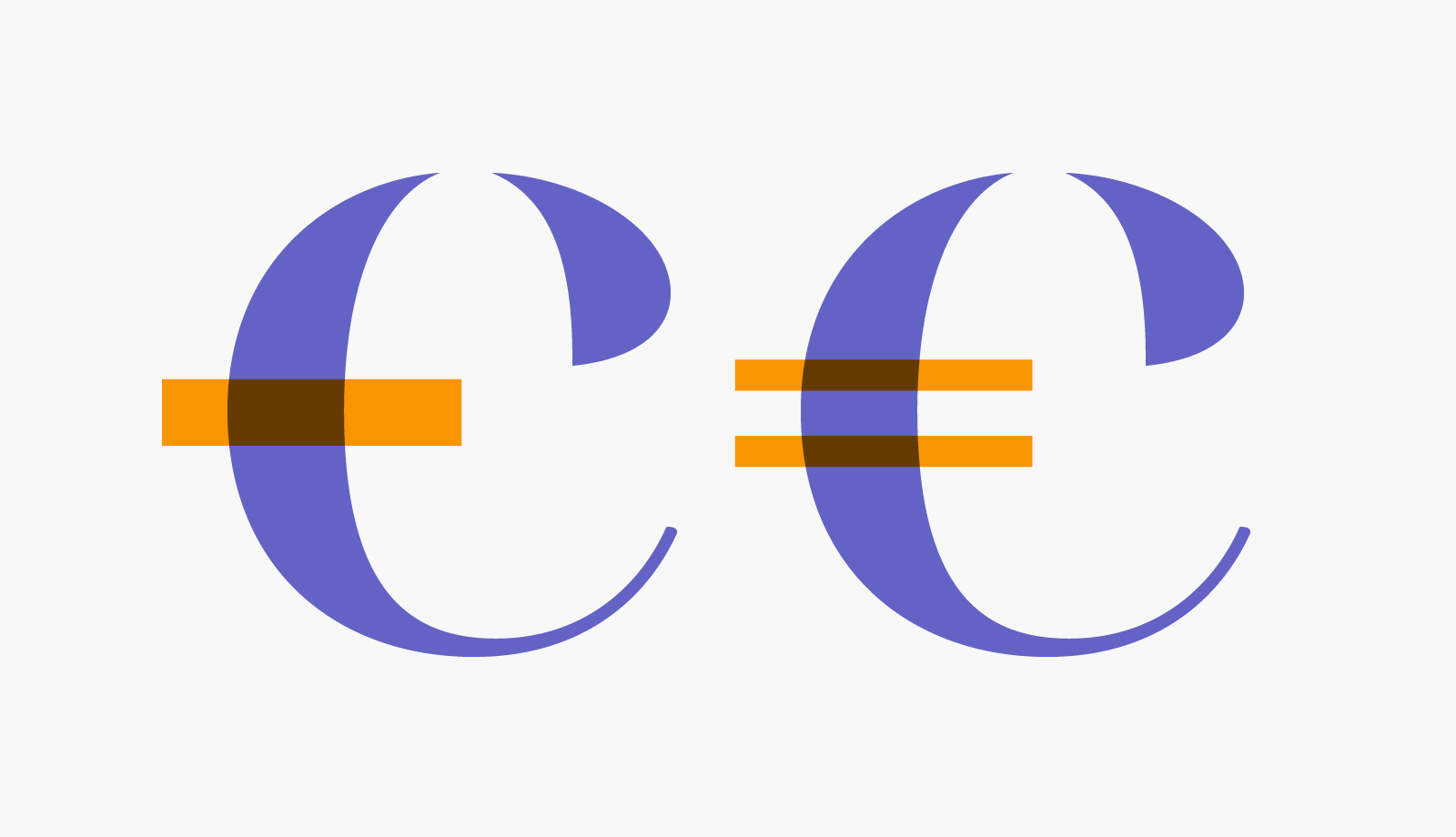
So, was the euro symbol Belgian or German? The mystery remains. However, one curious fact is clear. The European Commission tried to impose this symbol not as a concept to be adapted to the style of each typography but as a fixed-form pictogram (see the diagram below) without variations in style or weight. This was a clear violation of similar typographic conventions, as the dollar, pound sterling, and yen all have adaptable forms for their contexts.
This case, nonetheless, has a precedent, such as the example of the dreaded estimated symbol, which we typographic designers are obliged to include as is in our fonts, following Microsoft’s recommendations. For a symbol used only on the back of soda or shampoo bottles, that’s somewhat acceptable. But doing the same for a currency symbol of great importance seemed quite extravagant.
It indeed caused an uproar among typographers. Eventually, the normalizing persistence of European bureaucrats did not prevail over the common sense of typographers. A much wiser usage was established, where the logic of the symbol is adapted to the style of each character. Phew.
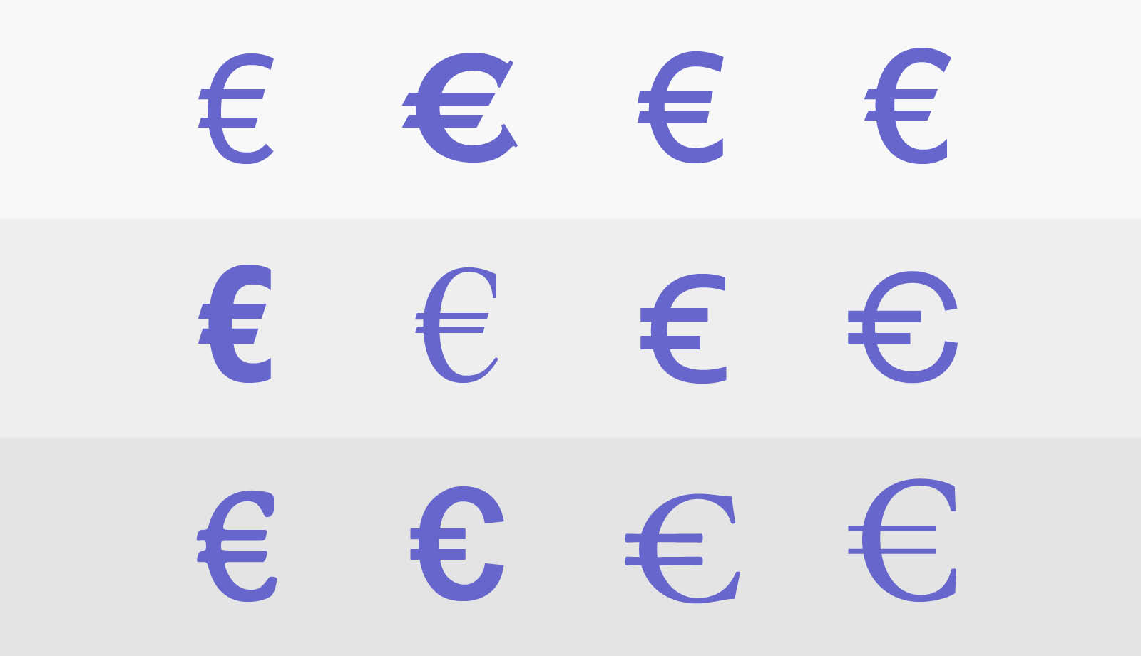
– Symbols that adhere to the guidelines as closely as possible.
– Symbols that adapt with more freedom.
– Symbols that conform to the formal logic of their typeface.
A bizarre explanation
As for the meaning of the symbol itself, the European Commission briefly explains on its website: “The symbol ‘€’ is inspired by the Greek letter epsilon (Є) and the first letter of the word ‘Europe’.”
Certainly… except that in uppercase, an epsilon (1) has the same shape as a Latin E. So, is it the lowercase epsilon (2) that’s being used here to form a proper noun without a capital letter bizarrely? Finally, to resolve this, the text presents a symbol that indeed resembles the euro symbol (3). Unfortunately, this last letter is not an epsilon at all, but a Ukrainian Ye.
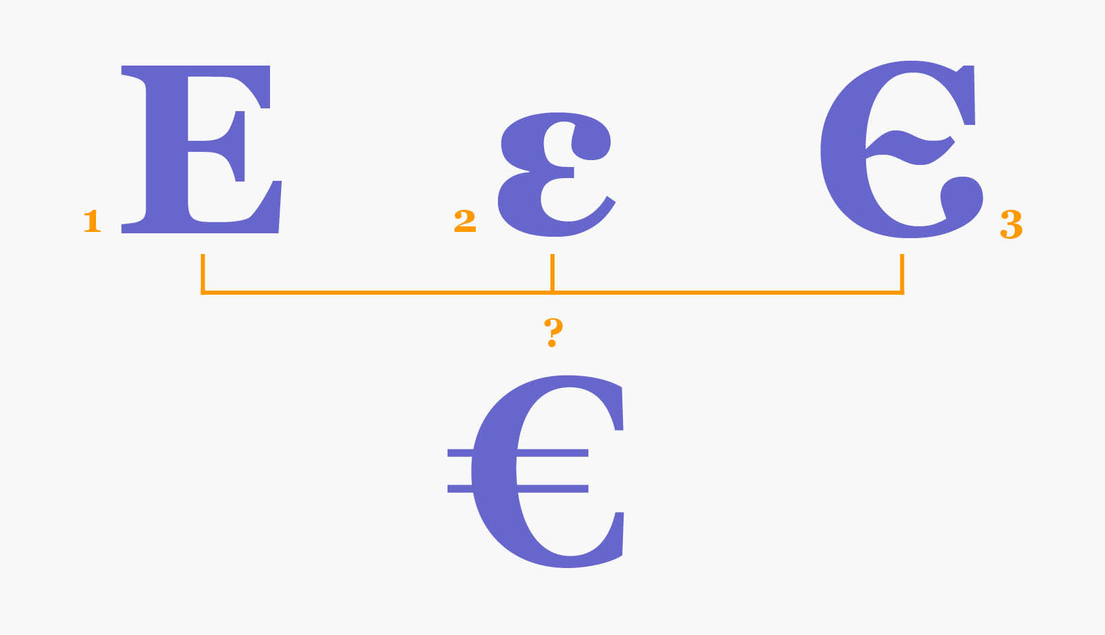
As for the parallel lines, they supposedly symbolize “the stability of the euro.” Really? It’s more stable with two bars? Why? We won’t get more information on that.
The typographic design of the euro
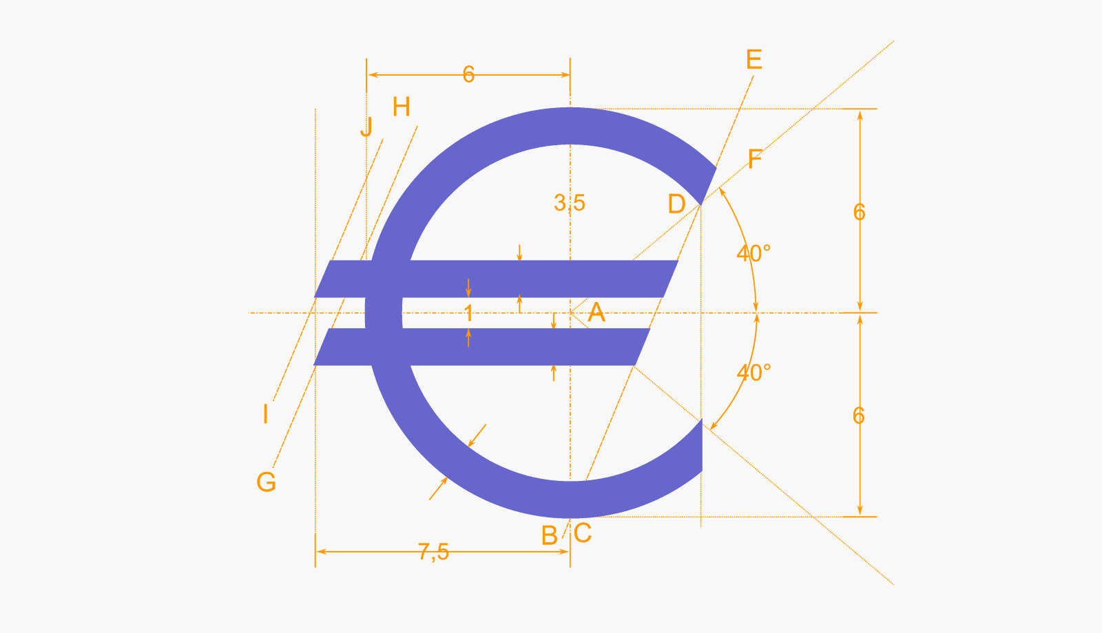
So, what can we really conclude about the euro symbol? It is based on a very sophisticated but unusable pictogram. After a convoluted process, the usage established a C with two parallel crossbars.
What is this euro symbol actually made of? In fact, we will never know. But all these half-truth explanations show how tortuous the thinking behind this symbol was. Ultimately, the obscurity of this story doesn’t matter, as typographic designers have found a way to draw this poor euro symbol.
“Tortuous,” “convoluted,” “obscure”… a truly European process, indeed.

Comments