
History of monetary symbols: the pound sterling (3)
I initially thought of writing just three brief paragraphs about this well-known symbol. However, the writing of this article took the form of a genuine little investigation. Let’s delve into the history of the pound sterling.
The pound sterling, or pound, is perhaps the most aesthetically pleasing of monetary symbols. Its design is wonderfully contrasting, featuring a flowing uppercase L and a rigid central cross.
However, one may wonder what the L refers to precisely. Clearly, it’s not related to “pound” or “sterling.” So, what is it related to? The French word “Livre”? That would be quite strange. To understand this, we need to explore the history of measurement systems.
Roman and imperial pounds
During the Middle Ages, European countries had highly varied and complex measurement systems, far from the rationality of the metric system. Over time, reforms in these systems occurred according to the needs and desires of the powerful, led by the minters responsible for producing a country’s coins.
The minters divided a pound of silver or gold into a certain quantity of coins, creating a relationship between weight and currency. The currency was often referred to in relation to its weight, and the primary unit of weight in goldsmithing since the Roman Empire was: the pound. The measurement of this pound varied by country, as did the subdivisions of these pounds.
For example, in the Byzantine Empire, the pound was worth 325 grams and was divided into 72 nomismata. Charlemagne’s pound was 435 grams, and it was cut into 20 shillings or 240 deniers. In medieval France, the pound varied between 380 grams and 552 grams across different provinces.
Pound sterling
The currency eventually adopted the name of the weight measurement through metonymy. The Latin term libra gave rise to various terms: livre in France, lira in Italy or Turkey, and… “pound” in the UK, through the Latin expression libra pondo (“the weight measured in libra”).
The English pound later acquired the epithet “sterling”, which history is surprisingly confusing. Historians debate between an etymology related to an old Norman coin bearing a star (Stoerra) or another currency brought by merchants from the East (Easterlings).
A French researcher has also put forward an alternative hypothesis, mentioning the estelin (or esterlin) system, an alternative weight system in goldsmithing parallel to the pound. Imported to England by William the Conqueror, it supposedly remained in use there, while later, Saint Louis abolished it in France.
The typographic design of the pound sterling
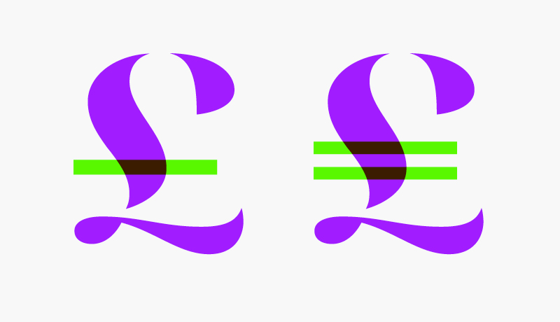
In any case, the pound sterling is symbolized by a cursive uppercase L crossed out. And, like the Dollar and the Euro, as a typographer, one wonders whether to use one or two bars.
At the beginning of my research, I found no theory favoring one option over the other. All sources mention a purely stylistic choice. The Bank of England, for example, has historically used both options: generally with the double bar until the early 20th century and mostly with the single bar since the 20th century.
Until I read an interesting proposal on the construction of the sign on an old page of the Royal Mint Museum. According to them, the bar is a sign indicating abbreviation (of the word “Libra,” as mentioned earlier).
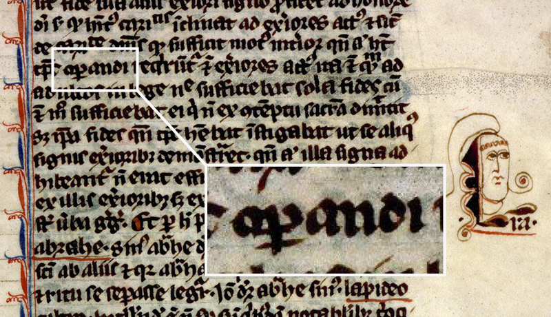
It’s true that such abbreviations were extremely common in the past, especially in the Middle Ages and the Renaissance. Here’s an example from a 13th-century manuscript: the barred p signifies the contraction of “per,” forming the word “operandi.”
The horizontal bar in £ may indeed be just an abbreviation mark, reminiscent of medieval fashion, and not an iconographic symbolism like the Dollar, or the remnant of a calligraphic gesture like the Pilcrow. Frankly, I had never thought about it before, but now that the idea is there, it seems obvious to me.
Tilde
I consulted Marc Smith, director of studies at the École nationale des chartes, and he confirmed: “Indeed, the bar in £ is a generic abbreviation sign. It is a tilde ~ in the form adapted to any letter with a stem. In the Middle Ages, it was mostly written with a lowercase L; the uppercase L £ prevailed in the modern era.”
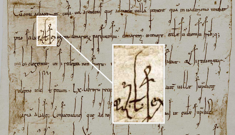
Marc illustrated his point with an image from an 11th-century diploma from the king of France. Interpreting, he said: “One reads the words ‘scilic(et) l(ibras) sexaginta,’ which means ‘namely sixty pounds.’”
The big “l” crossed out between the two dots is indeed a “£” dating from the eleventh century!
In paleography, we indeed speak of a “tilde.” It’s not a diacritical mark but an abbreviatory sign. Over time and through calligraphic use, the tilde took on its wavy aspect, which became fixed when it got transformed into a diacritic. Everyone knows the famous Spanish ñ. But as an abbreviatory sign, the tilde could be wavy or straight.
So, one bar or two?
This tilde abbreviatory sign is the origin of today’s pound sterling symbol. As for the sinuous silhouette of the capital L, it comes from modern round hand style.
Which leads us to conclude that the L must logically be crossed by a single bar, and not two. Not that there would be an error with a double bar… but let’s say a single bar more rigorously adheres to the historical logic of the character.
It’s not surprising that, to symbolize the oldest currency still in circulation, a sign from a long and venerable tradition is used.

Comments
The word libra for pound and hence the L, comes from the Latin therefore not French.
The abbrviation of Libra, lb, is used for pound.
Absolutely, for the pound as a unit of mass.