
Uncover the potential of your fonts with OpenType features
The OpenType format has considerably increased the potential of fonts… but how can we get the most out of these functions? Let’s look into the main OpenType features and how to activate them.
Ever since computing had been thrust into the world of graphic design, typefaces have been diffused and used in software form. It is with this software that we now refer to typography with the term ‘font’. Several font formats were to follow, but the OpenType format marked a turning point. It had emerged at the beginning of the century, with .otf or .ttf file extensions, replacing the old PostScript and TrueType fonts. The OpenType format began to provide users with previously unseen possibilities.
It all began with resolving the annoying problem of incompatibility between Mac and PC. Today, the same font can be installed indifferently on an Apple or a Windows system. Users are thus guaranteed to see their text (on Word, on Indesign, etc.) behave exactly the same way, whether opening work files on a Mac or PC. This in itself, was a relief.
Next, OpenType allows to be included within the font, a variety of functions that will influence its behaviour and refine the formatting of the text. Variations of letter forms, extensions, ligatures, suspended figures… the list is long and we will explore some of these functions in detail further on.
A stubborn obscurity
Alas, though the specifications of the format were developed a while ago (from as far back as 1997), the potential of OpenType fonts remained largely unknown to graphic designers for some twenty years. And whose fault was that, exactly? Well, blame Microsoft and Adobe. In fact, the most popular types of typography processing software that they themselves produced had taken a long time to support OpenType features. Functions they developed themselves… It may be strange, but such is the fact.
As a result, users perceived little change in the 2000s with the introduction of .otf or .ttf fonts. Only some files were installed, as before with the old PostScript and TrueType fonts. In reality, these OpenType fonts could contain hidden treasures, which could happily be activated more and more easily.
Basic or Pro fonts
Note that OpenType functions are not necessarily included in all OpenType fonts. This remains a choice of the editor, who can choose to, or not to, enrich a font with one or more functions. We can sometimes distinguish the enriched fonts as the ones marked as ‘pro’, but this once again is the choice of the publisher. For example, a Garamond ‘Pro’ by Foundry X does not guarantee richer content to the ‘simpler’ Garamond by Foundry Y. The only clear solution is to consult the specimen and check the extent of the character set as well as the available OpenType functions.
How to enable OpenType features
Let us begin by looking at where the activation commands are.
- On Indesign
The most complete access in Indesign is found in the Control Palette, at the top right of your screen.
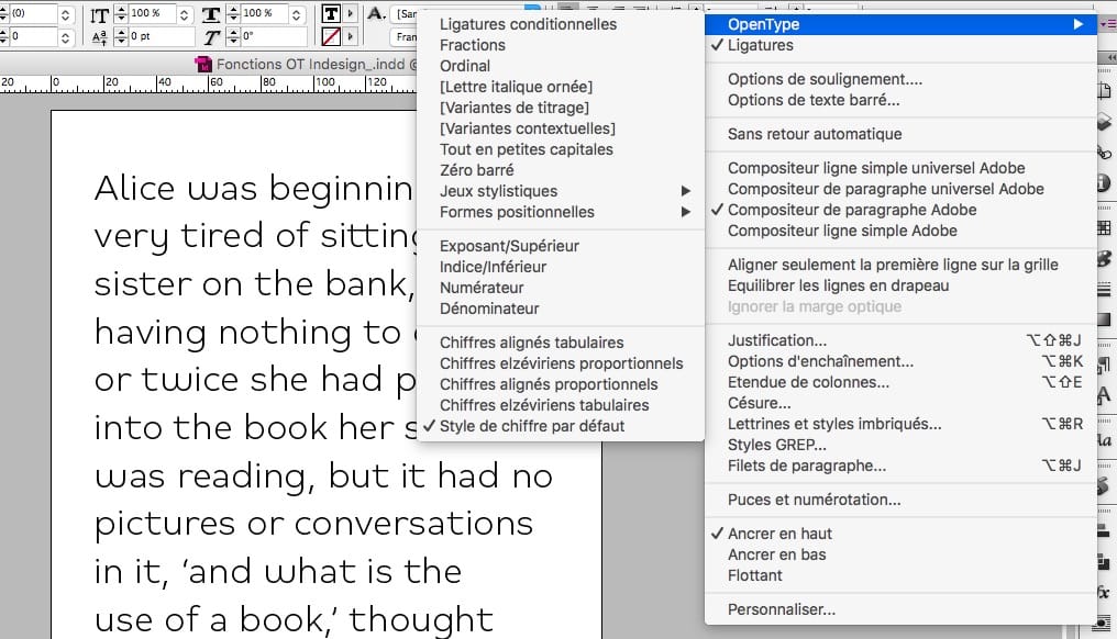
However, from the 2017 version onwards, Indesign also displays variants of letter shapes with a single click. Just select the text you want to edit and an OpenType icon automatically appears.
- On Illustrator
Here you have to open the appropriate palette in Windows> Text> OpenType. From here, you can even use stylistic sets.
- On Word
Since Word 2013, access to OpenType settings has finally been simplified. Just select your text and choose the option you want to activate with the Text Effect tool.
Note that with the 2010 version, ligature activation is already possible: right-click within the text, choose the Font Menu then click on the Advanced tab, containing OpenType options. It’s not very convenient but works well enough.
- On PowerPoint
There are rumours on the net that PowerPoint supports OpenType features. Alas, it is not the case, and the recent new version of Office 2019 unfortunately offers no update in this area.
Listing the principal functions for OpenType fonts
A number of OpenType functions are possible, with OpenType fonts comprising a few functions each. Some are enabled by default, and others require user activation.
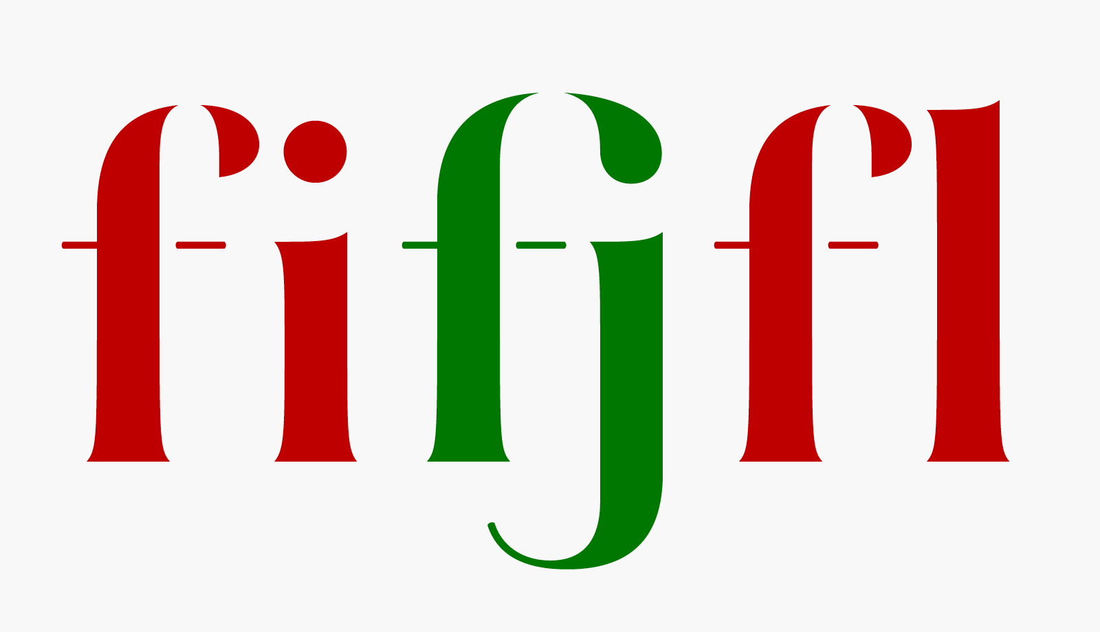
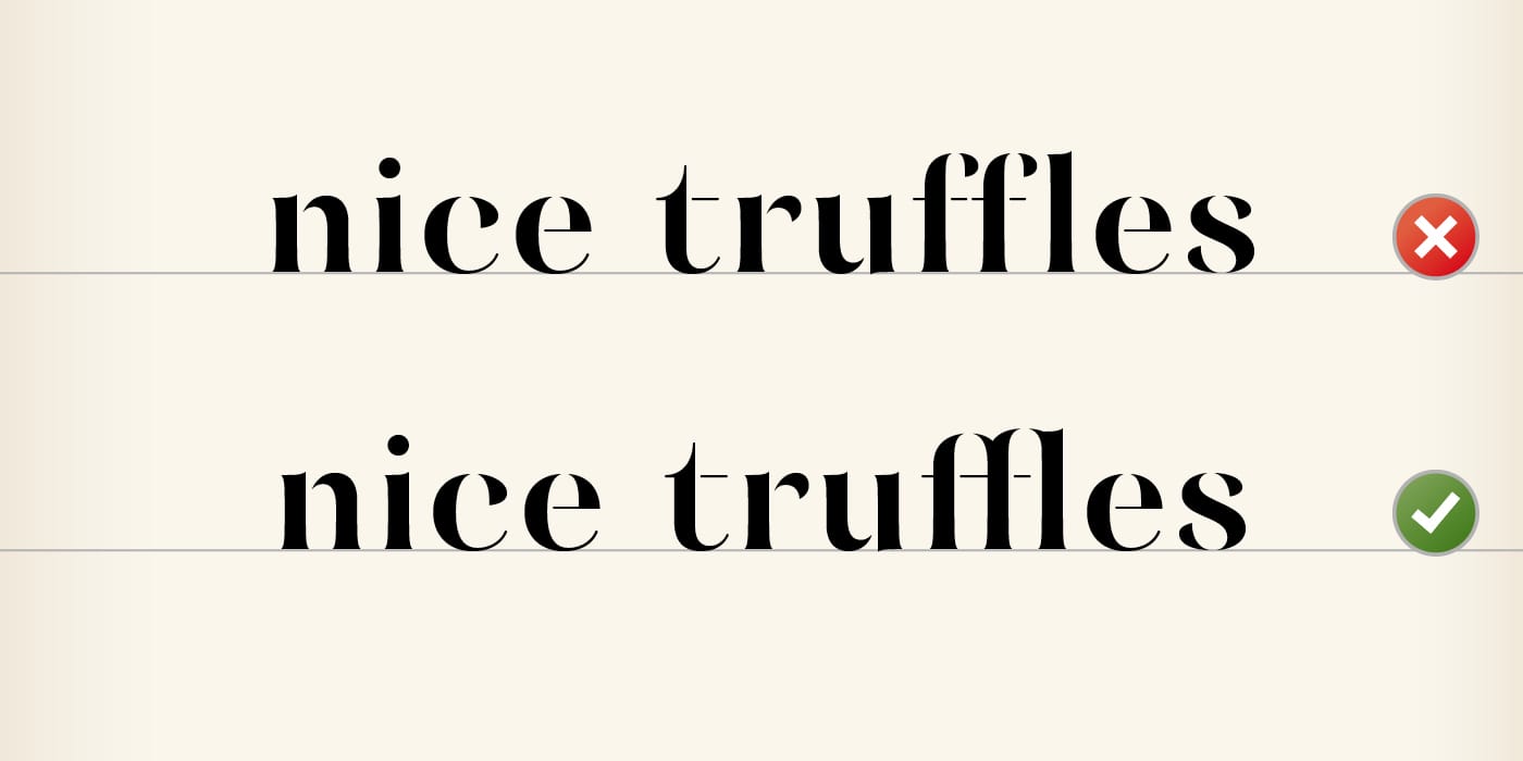
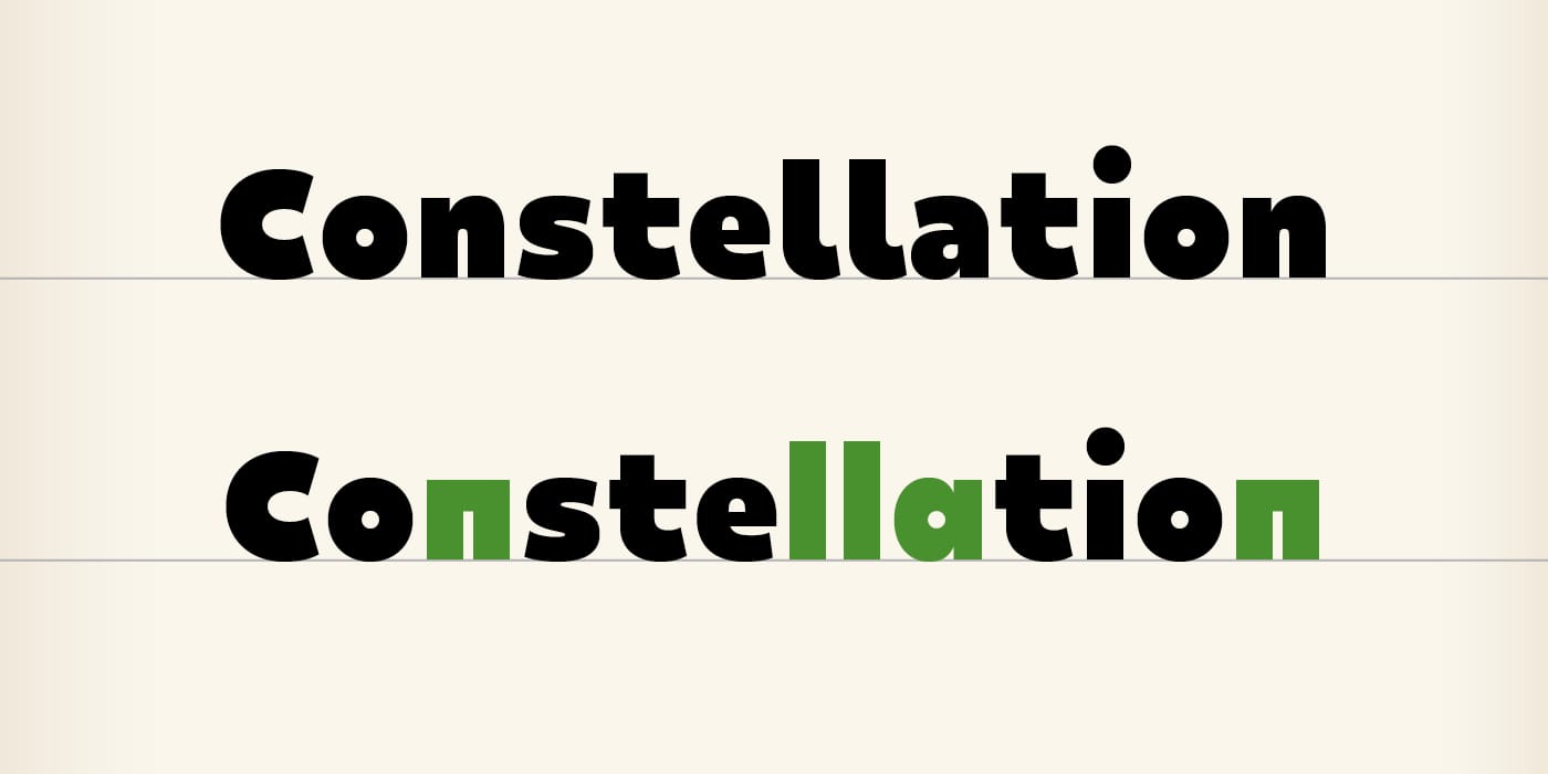
- Ligatures
These are the ligatures that are needed to make text more fluid, such as fi, ffl, and fft. This is the most basic function that I would deem indispensable. They are usually enabled by default on Indesign and other Adobe software, but as can be expected not on Word. In the latter you would have to activate them manually with each document created.
- Discretionary Ligatures
Some ligatures were designed to be more decorative and may not always be suitable for the layout you are creating. This is why these ligatures are placed here as they must be disabled by default, and activated only at the discretion of (by choice of) the user.
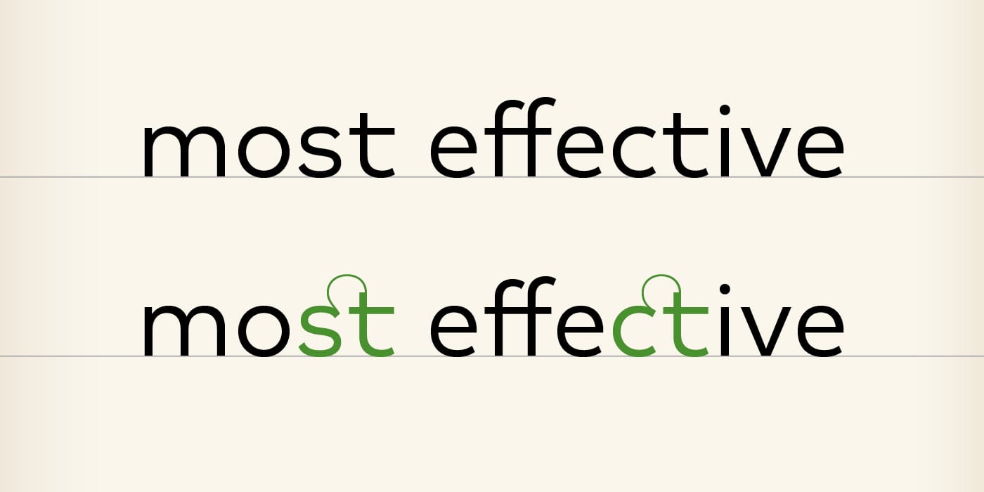
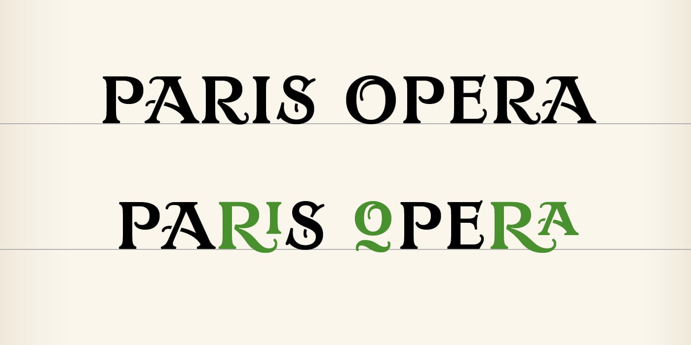
- Contextual Alternates
These are alternate forms that are triggered according to the context. These may be ligatures or alternate letter forms to fit the presence of a specific neighbouring letter, or to fit a position within a word or line. This function is usually activated by default, but there may be occurrences where you would have to activate it manually.
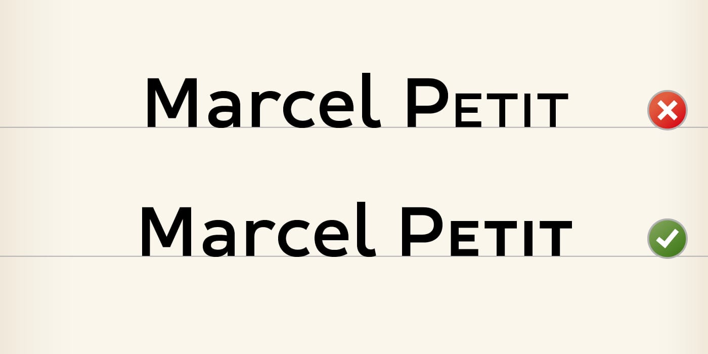
- Small Caps
As the name suggests, Small Capitals are capital forms in small size. If the OpenType function is not present in the font, the software tinkers at getting small caps from capitals, which results in glyphs with weak weighting. To correct this, the Small Capitals must be designed and included in the font, then activated via this OpenType function.
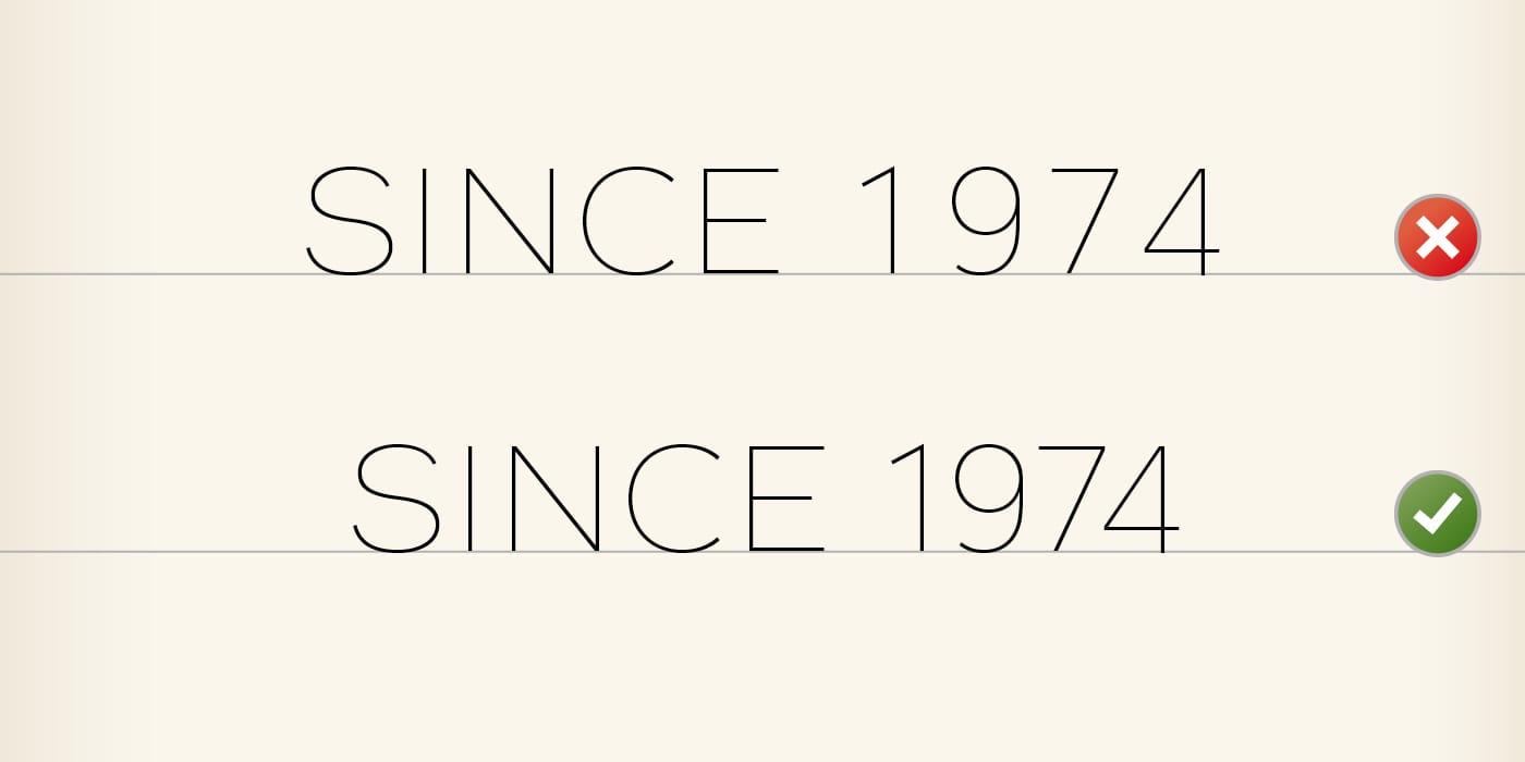
- Proportional Lining Figures
The default figures are tabular aligned figures. ‘Aligned’ refers to alignment on the height of capitals, and tabular because each figure is set on the same flush, to allow the generation of a chart. Most of the time, you will need figures that flow in the rhythm not of a painting, but of a text. You will therefore often be interested in selecting the proportional figures, whose flush varies according to the width of each glyph. Remember to set this function in your style sheets.
- Proportional Oldstyle Figures
Oldstyle Figures can sometimes be found as variants of Lining Figures. These are designed to flow in the rhythm of a running text, composed mostly in lowercase. They make it possible to avoid the effect of a ‘black block’ that produces a year or a reference within a text. That said, this effect may be desired to highlight important information (a phone number, for example). Therefore, you have full freedom to choose between Lining or Oldstyle Figures, thanks to OpenType functions.

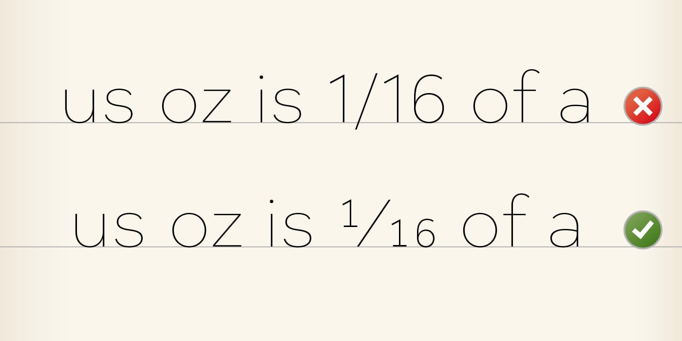
- Fractions
Here you have an OpenType function often overlooked by graphic designers. It makes it possible to transform a sequence of ‘digits – slash – digits’, into a Fraction properly designed. This is not a vital function certainly, but it can look pretty cool!
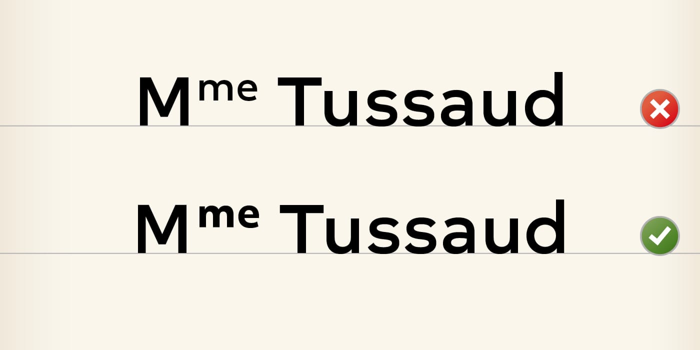
- Superscript
This is again a small refinement that, without much decisiveness, can make your text appear more elegant. The basic functions of the software tinker at getting superscript from lowercase, which would otherwise result in weighting problems. This is a lot less displeasing to the eye than fake small capitals, therefore it’s worthwhile to make the effort to activate the actual Superscript. Your type color will thank you for it.
- Stylistic Sets
These are functions that are customisable to your liking. When a font developer wants to integrate an OpenType program that does not match the pre-defined functions, this is where it is placed. Each font can receive a maximum of twenty Stylistic Sets, with each set to be numbered. Since the 2017 release, Indesign (finally) displays a brief description of each Stylistic Set. If you are using an earlier version, refer to the specimen of the character to know which number corresponds to which program.
Updating OpenType features by software
Keeping an array of OpenType features up-to-date with each software release is an extremely tedious job. Moreover, to my knowledge, nobody does it… (if you know of an example of someone who does, I would appreciate if you let me know in the comments).
There are however tables that exist – incomplete, but still useful – that are available on the net. The two I use are MyFonts and I Love Typography.
À suivre
I hope you’ve learned a little about these famous OpenType features, and I especially hope to have inspired you to want to explore them further. I have limited myself to describing the most common features, as there are still many others, not to mention the possibilities offered by the new OpenType variable font format. We will get to them another time as to date, they are still yet to be fully operational. In the meantime, I wish you all the best in your texts refined to the extreme, thanks to OpenType.

Comments