
Typographic space: invisible, yet essential
When discussing typography, we instinctively focus on letters, curves, serifs—anything visible. But some of the most decisive typographic signs are invisible. The typographic space, a full absence, sets the rhythm, articulates content, and sometimes saves the layout.
In this article, we’ll explore its main variations, their use across software and the web, and address some lexical particularities. Ready to dive into the void? Let’s go.

Different types of typographic spaces
Let’s inventory the primary spaces used in text composition.
● Regular space
This is the basic word-separating space—often called the “word space.” Its width depends on the font, typically a quarter or a third of an em, and it’s inserted by pressing the spacebar.
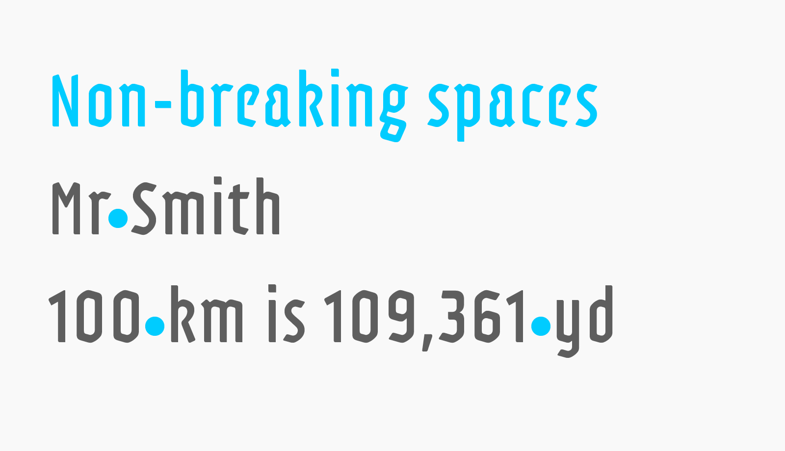
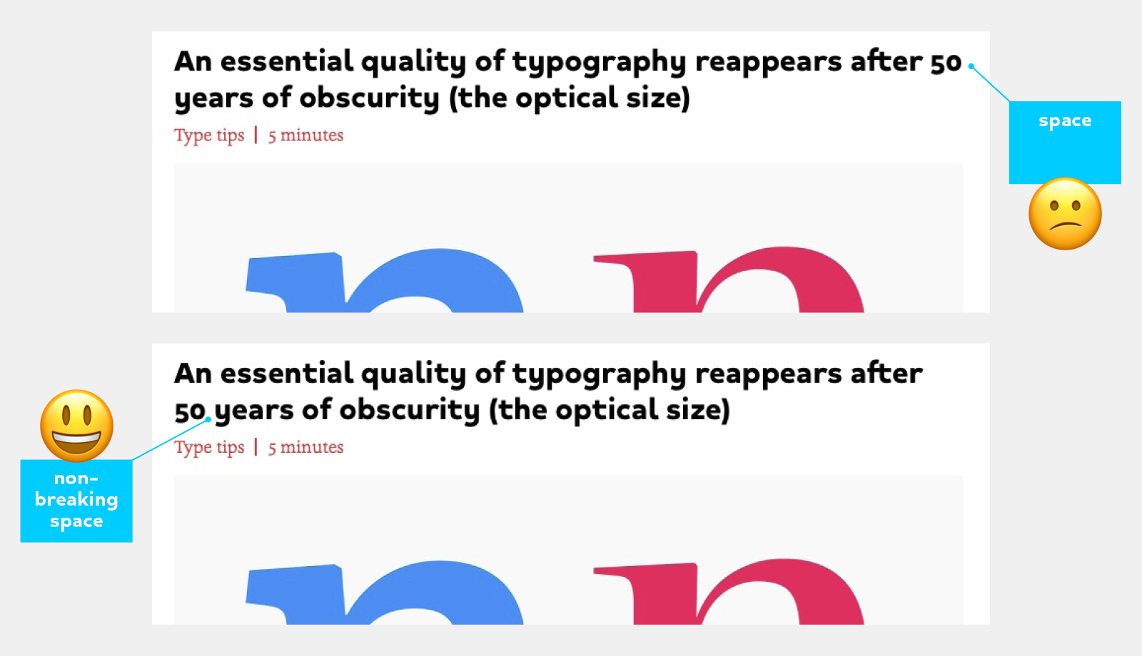
● Non-breaking space
A space identical in width to the regular word space, but which prevents unwanted line breaks. It is especially useful between a number and its unit (e.g. 25 km), or after certain abbreviations (e.g. Mr Smith). Whenever two words function as a pair, you generally don’t want the first part to end up alone at the end of a line.
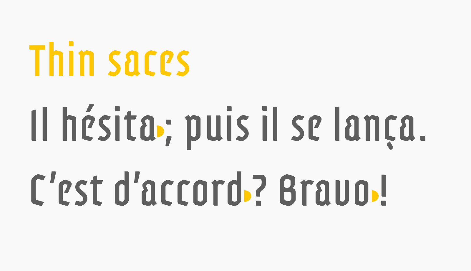
• Thin space
This is a narrower space than the standard word space. While this convention is not used in English, understanding it is essential when typesetting French texts—or any multilingual layout that follows French typographic rules.
The thin space is traditionally inserted before double punctuation marks such as ; ! ?. It is a discreet marker of refinement and precision in high-quality typesetting.
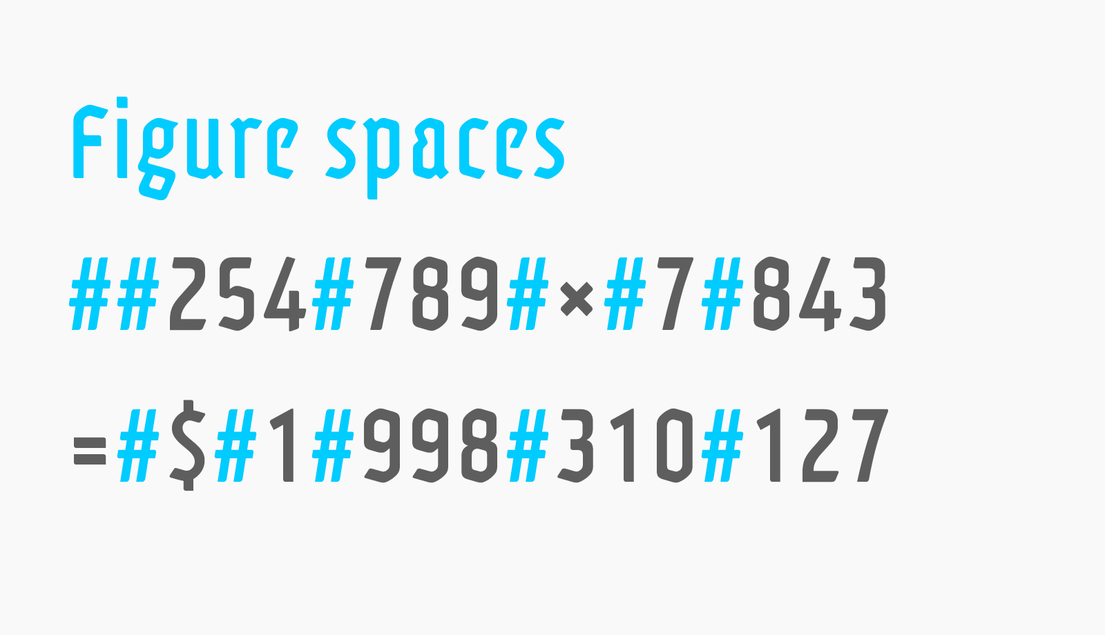
● Figure space
Less known but highly useful, the figure space (also known as numeric space) has a fixed width matching the width of tabular figures—perfect for aligning numbers in tables or calculations consistently.
Typographic spaces on the web: HTML entities & Unicode
HTML can be typographer-hostile, yet it supports these spaces with specific entities. Here’s a quick reminder for inserting the correct spaces in your web pages:
Space type – HTML entity – Unicode
Regular space — (space) — U+0020
Non-breaking space — — U+00A0
Thin space — &8239; — U+202F
Figure space —   — U+2007
Please note that not all environments correctly display all space variations. This would be too easy… Test as needed before confirming.
Using spaces in Indesign & word processors
In InDesign, spaces are easily accessible by simply right-clicking and then selecting Insert Space. Among the available options, we find the spaces that interest us:
– Non-breaking space
– Thin space
– Figure space
Mastering them enables near-surgical typographic control.
In Word, LibreOffice, or similar, special spaces are more restricted but still accessible via character palette or Unicode entry on Windows systems.
Invisible, yet indispensable
A space has no weight, no strokes—it’s neither thick nor thin—but it embodies invisible elegance. Often overlooked, it absolutely deserves your attention. A fitting reflection by Hermann Zapf (albeit likely apocryphal) connects: “Typography is the art of spacing letters.”

Comments