
An essential quality of typography reappears after 50 years of obscurity (the optical size)
In the days of lead type, it was taken for granted that the design of a typeface would vary depending on the sizes for which it was intended. The transition to digital had abolished this practice, which was nevertheless fundamental. It is finally coming back into favor with variable fonts, optical sizes, and the latest InDesign update.
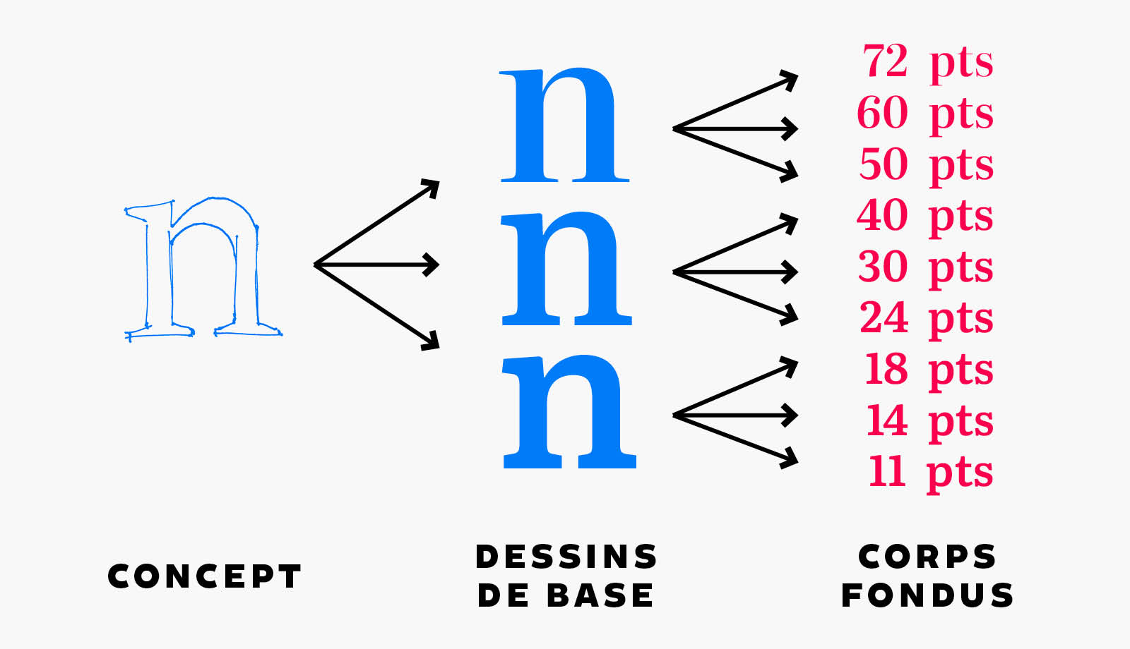
Lead type had been the vehicle of printed letters since the Renaissance. It gave them their imagery, their universe, their mythology, and also their best practices. One of these practices was that the creation of a typeface necessarily involved the creation of several design variations.
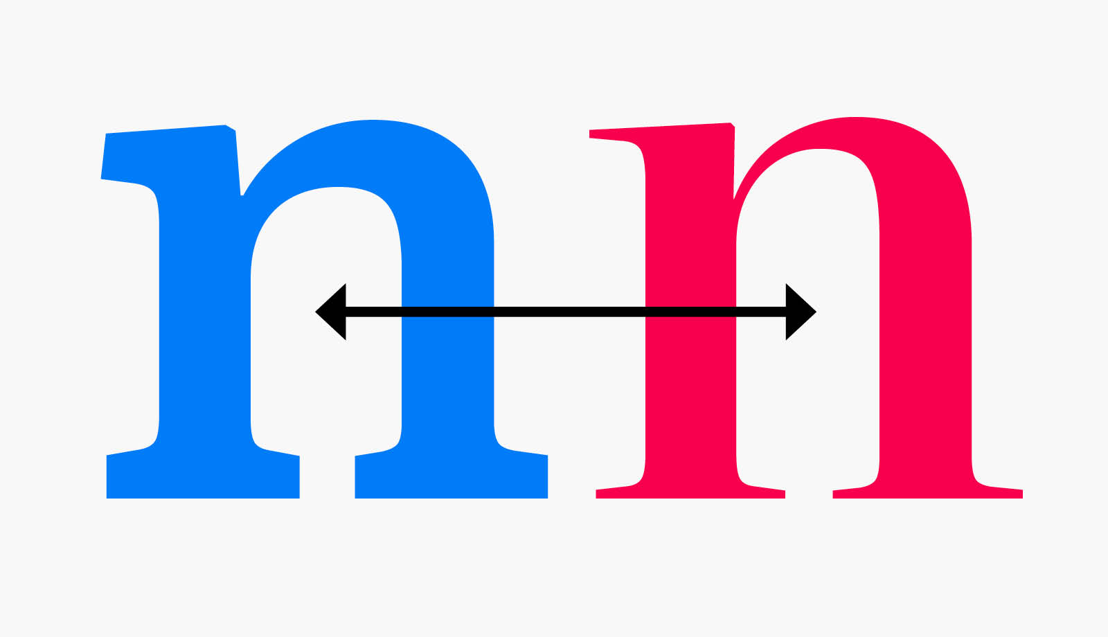
One design was intended for small sizes, for setting blocks of text. Another design was intended for intermediate sizes, for subheads, captions, and other annotations. Yet another design was meant for large sizes, such as book or chapter titles.*
After five centuries of loyal service, lead type gave way to phototypesetting in the 1960s, and then to digital in the 1980s. In this transition, the practice of creating design variations tailored to specific sizes was completely sacrificed on the altar of profitability.
A hasty digitization
All typefaces digitized from the 1980s onward were based on a single design. This vector-based interpretation could then be scaled to any size without losing edge precision. While this principle might seem convenient at first glance, it actually led to a terrible dilution of typography.
Indeed, since digital fonts had to be usable both in small and large sizes, the designs chosen as models were most often of intermediate sizes. This resulted in digital typefaces that were neither effective enough in small sizes nor bold enough in large sizes. In short, lukewarm typefaces.
And we lived with this for forty years. However, type designers did not spare their efforts in trying to reintroduce the culture of design variations, now referred to as optical sizes.
Recovering the lost finesse
In the 1990s, Adobe introduced Multiple Masters, a brilliant technology that allowed users to create their own design variations based on several parameters, including size. It didn’t succeed. Probably too complicated for modern designers pressured by increasingly impatient clients.
The idea of Multiple Masters resurfaced around 2015 with variable fonts. This time, everyone got on board: Microsoft, Adobe, Apple, and even Google. The technology is more in tune with market needs and better integrated, as it is supported by the OpenType format, already established in both design software and on the web.
Since 2015, the typography market has seen a growing number of variable fonts, which offer all sorts of wonders, including the one that concerns us: varying optical sizes.
(Literata typeface, by TypeTogether)
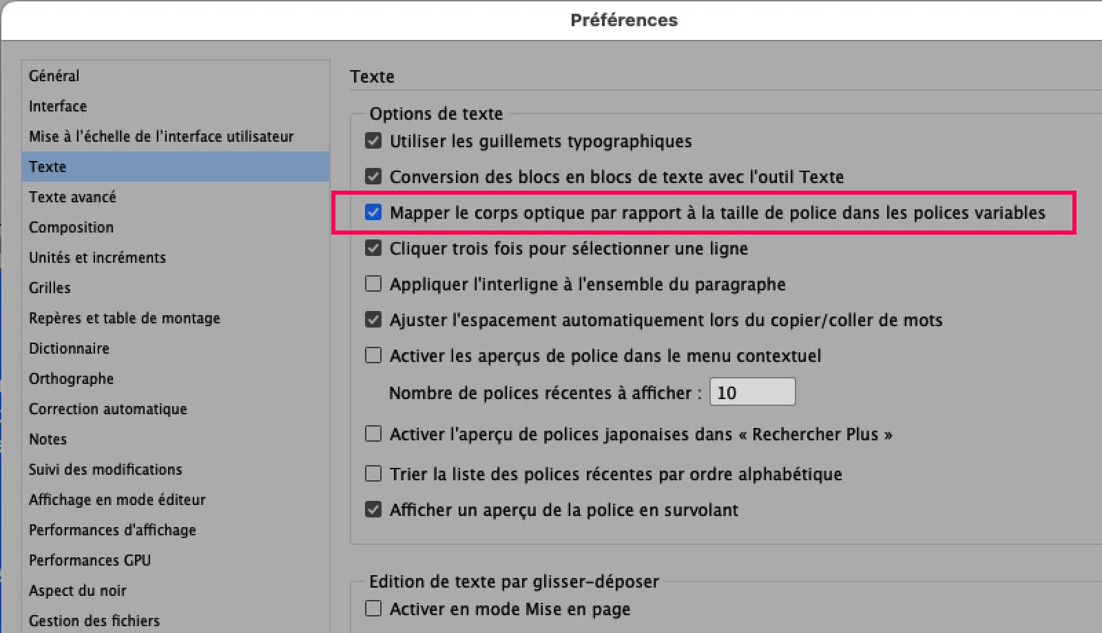
In 2021, the final step in this evolution was reached with the release of a new preference in InDesign (16.2): the automatic optical size mapping. A variable font now automatically adjusts its design, whether you are setting it in a small or large size.
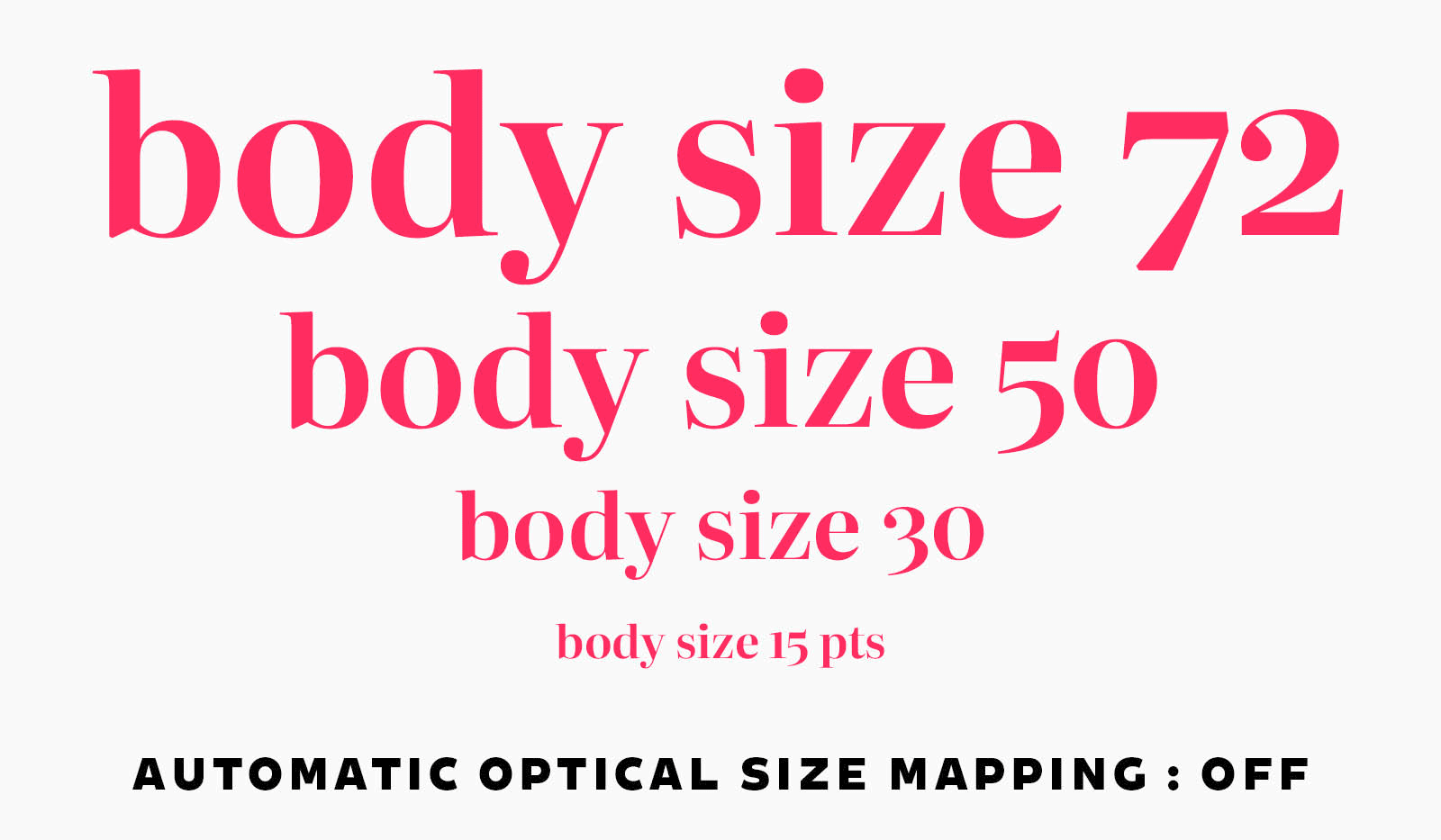
Designers now have, once again, effective tools to set text according to best practices. They just need to make sure to choose a variable font that has an “optical size” axis.
But they still need to know about it to take advantage of it. Because one can’t say that Adobe made much effort to inform its users.
The revelation of optical sizes
This was the state of affairs until, this summer, a window appeared on my screen, like an apparition of the Archangel Gabriel. Saint Adobe deigned to inform me that my font was variable and that it would adjust itself. The San José firm was finally doing some teaching.
Saint Bruno in Prayer (Giovanni Maria Viani, 17th century, Musée de Valence).
What’s the point of implementing new technologies if users aren’t informed? Are all designers and art directors aware of the enormous benefits of variable fonts? There is certainly still some work to be done in this area.
But we can finally be optimistic. Software, both on Mac and PC, as well as the web, is increasingly supporting this technology. As for type foundries, they continue to offer new variable fonts with ever more unique behaviors.
All that remains is to show a little boldness and creativity, and typography will regain all the prestige it lost a bit in the enthusiasm of the digital revolution.
* I am simplifying deliberately: there were no strict rules. Javet and Matthey indicated in 1956 that a typeface was generally cast in sizes ranging from 4 to 72 points, with about four design variations created, implying four to five basic designs. Chamaret and Gineste report that at Fonderie Olive, Choc was cast in ten sizes (10 to 60), based on three designs. And that Mistral was also cast in ten sizes (12 to 72), but based on only two designs.

Comments