
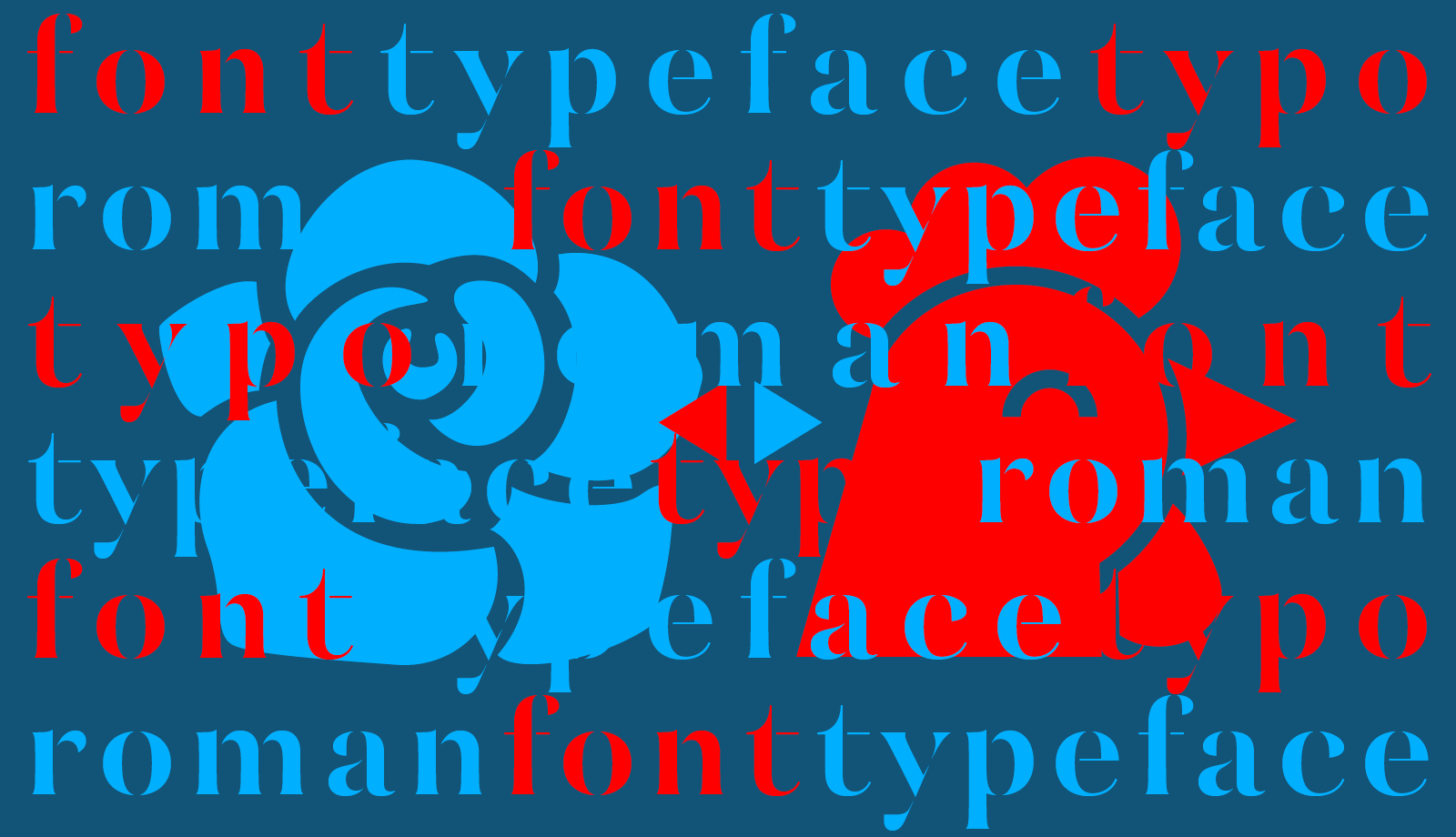
Font, typeface, typo… when English and French meet in typography
In the world of graphic design, English dominates the conversation. But some of its most common technical terms are actually born from French. Some terms crossed the Channel centuries ago and never looked back. Others, like font, return to us, transformed. This article explores the back-and-forth exchange between two of typography’s richest linguistic traditions.
Font
Let’s start with one of the most ubiquitous terms: font. A word so central to our digital design vocabulary that it feels native to English. And yet, font is a French word in disguise.
Font derives from the Old French fonte, which means “a casting” — the act of pouring molten metal into a mould. The modern English term casting eventually replaced it in general use, but font remained in typography to designate a specific set of types for printing.
So when designers say font, they’re unknowingly echoing centuries of French typographic history. Today, the digital font may have little to do with molten metal, but the word itself still carries the trace of its origin.
Ironically, font is now perceived by some French designers as more technical or more contemporary than our own fonte… Hence the French version of this article, where I try to gently shake them up.
Typeface
The English term typeface and the French caractère correspond directly, meaning a family of letters sharing a common design. Interestingly, both languages arrived at this meaning by using synecdoche — the figure of speech where a part stands for the whole.
In the days of letterpress, the face of a piece of movable type referred to the part of the metal sort that bore the letterform. In French, this part was called l’œil — the “eye” of the letter. English speakers, more poetically perhaps, chose to call it the face.
Thus, a typeface was, literally, the “face of the type”. And by extension, it came to mean the design of an entire set of characters in the same family.
So here we have a shared logic between both languages: name the visible surface, and let it stand for the whole.
Typo
Here’s a perfect example of a false friend.
In English, typo is short for typographical error, meaning a mistake in the text — usually a slip of the keyboard. In French, however, typo is a casual abbreviation for typographie. That is: the art and craft of designing, setting, and printing type.
This mismatch can cause some confusion. For instance, the name of my blog, Café Typo, means “typography café” — a space to discuss type, not to collect embarrassing spelling mistakes!
So if you ever stumble across a French text where typo seems oddly celebratory, don’t worry — it’s not about glorifying errors, just a fond nickname for an art form.
Roman
Here’s another familiar term with a surprising backstory. In English, roman refers to the upright style of a typeface, as opposed to italic. It’s a standard typographic term — but one that might seem oddly specific, even archaic.
Its origin is the French word romain, which itself refers to the early Renaissance humanist calligraphy inspired by classical Roman inscriptions. In France, romain still simply means “upright type”.
When early printers adopted this style, the term traveled across Europe, including into English — where it remains unchanged, centuries later.
In conclusion
Typography has always been an international affair — and so is its vocabulary. Some words took a detour through France, others came straight from Latin, and a few are just… confused.
But behind every font or typeface, there’s a story worth knowing. Because if we spend so much time shaping letters, we might as well pay attention to the words we use to talk about them. Especially if those words think they’re English but are secretly wearing a beret.

Comments