Public Typography in Saint-Étienne
Last March 31 and April 1st, I was invited to lead a workshop a little out of the ordinary during the Biennale du Design in Saint-Étienne, France.
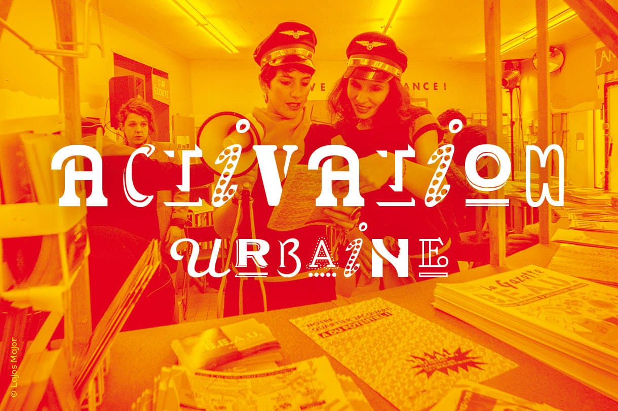
Biennale du Design in Saint-Étienne
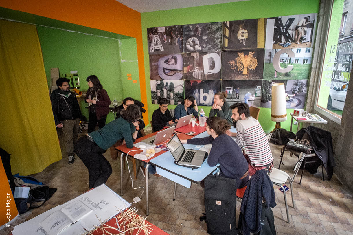
Offered to festival-goers and to the public from Saint-Étienne in general, the workshop aimed to raise awareness eyes to the beauty of typographic heritage of public space. Typography was honored this year in the official program of the biennial, with several exhibitions on type design projects as a response to a problem. Here in the unofficial program I proposed people to meet type design in its historical reality, and to get to know in a fun way with today’s type design process.
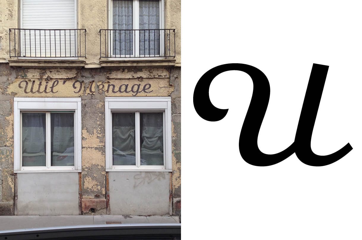
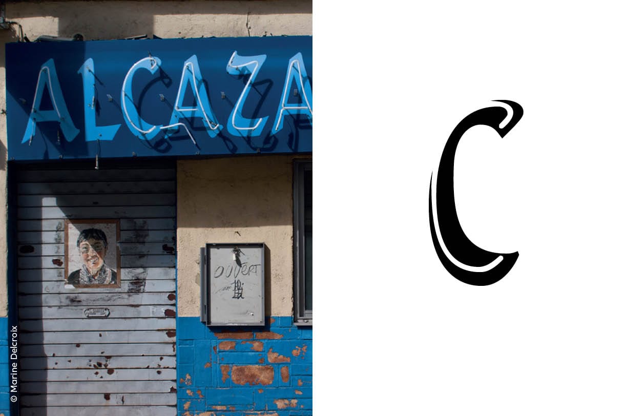
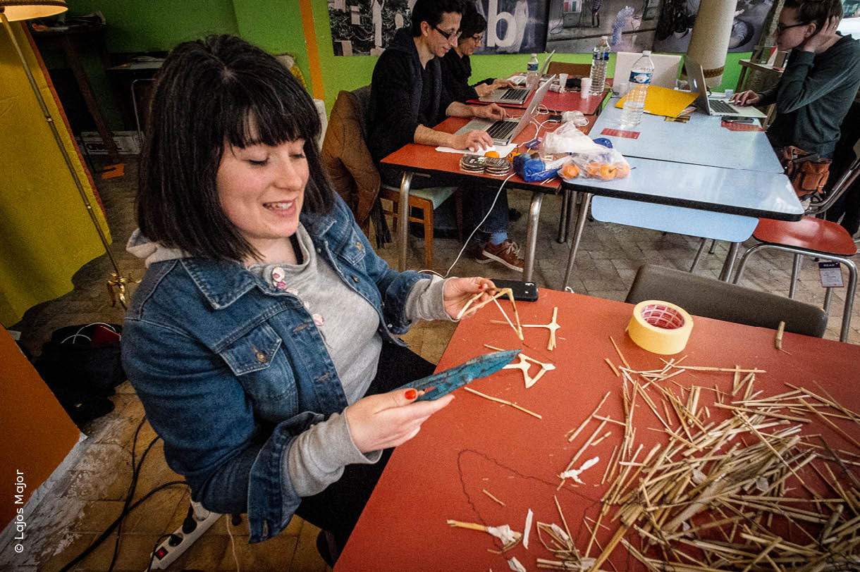
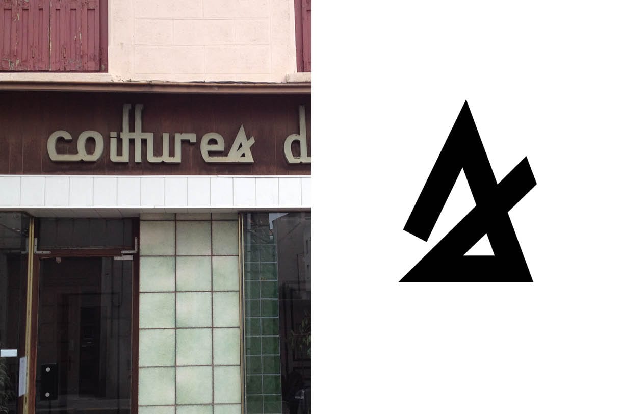
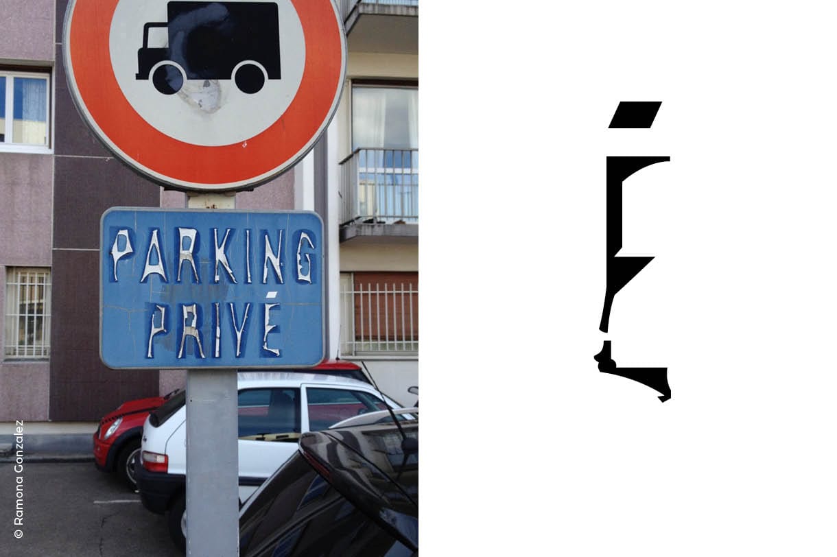
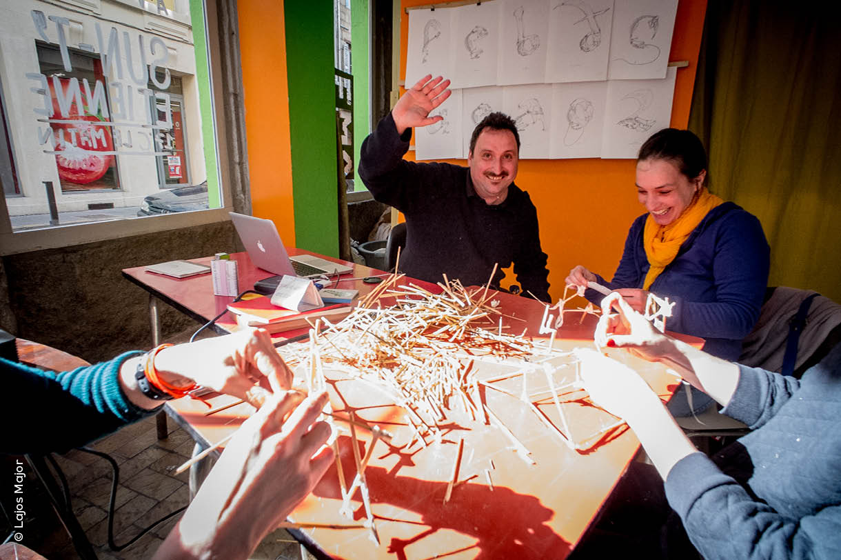
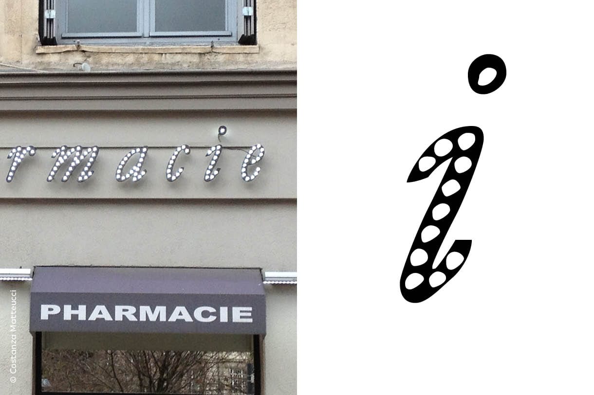
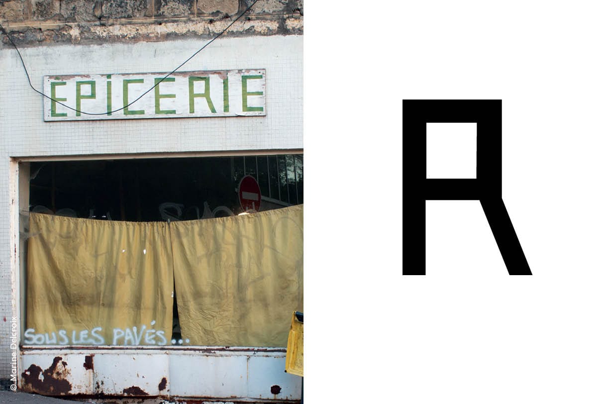
For two days I invited participants to photograph shop signs, street signs, inscriptions of all types, and other sign paintings. And then bring them to see them vectorized, reinterpreted in original forms, and integrated in a font that was intended to be public… since it came from the public space.
Invited by Costanza Matteucci, in conjunction with the B.E.A.U (Office of ephemeral urban activation) and the association Carton plein, I fit into an original set that was designed to revitalize the Jacquard district, a neglected area of downtown. Disused shops had been invested by the collective to organize a series of festive and creative events. It’s in the shop called Typo Topy that Sainté Mix operation occurred.
Sainté Mix
My idea was to keep only one letter in each pictured lettering, and make of this collection a kind of typographic patchwork representative of the city. I chosed not to select the most attractive letters, but to report to the best of the variety of urban inscriptions.
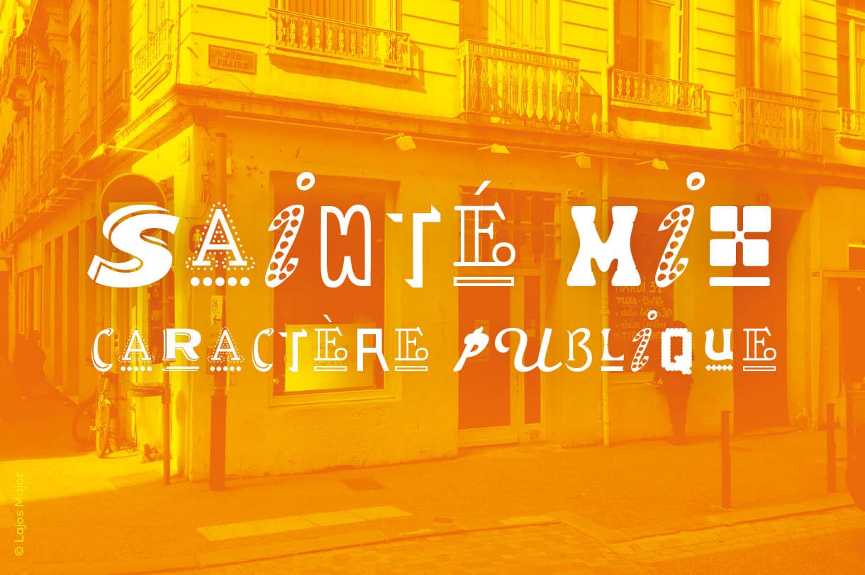
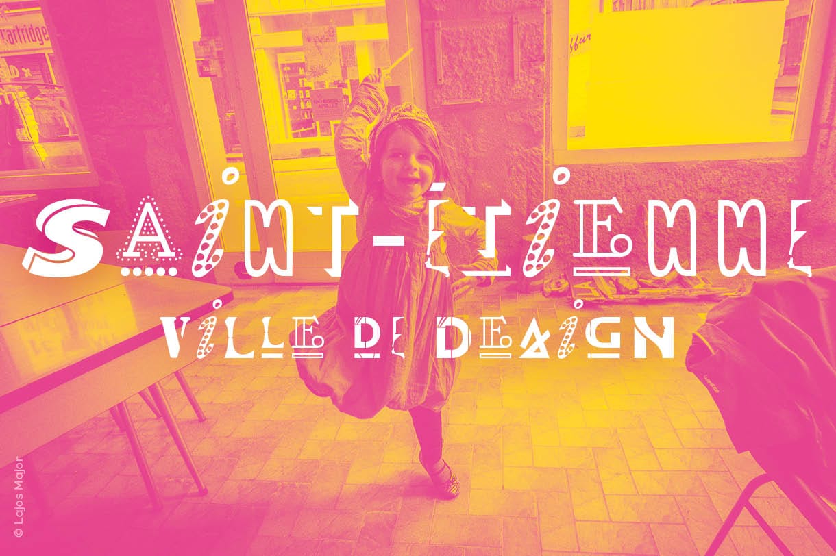
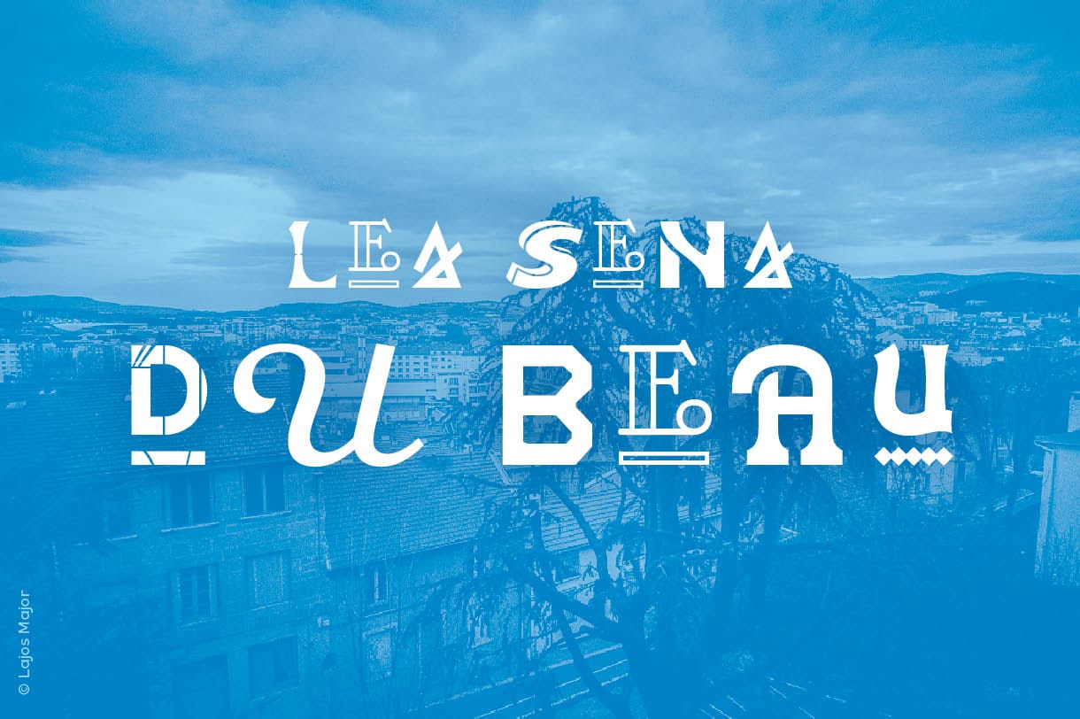
The result is a surprising unclassifiable typeface, nor really beautiful or really ugly, but with interesting force and presence. Its was christened Sainté Mix: Sainté for Saint-Étienne, and Mix for the mixing of styles.
Does it render the typographical identity of the city? Would the same exercise done in other cities end up with typefaces of radically different colors? This is of course difficult to say. In any case the experience was exciting and certainly deserves to be done again.
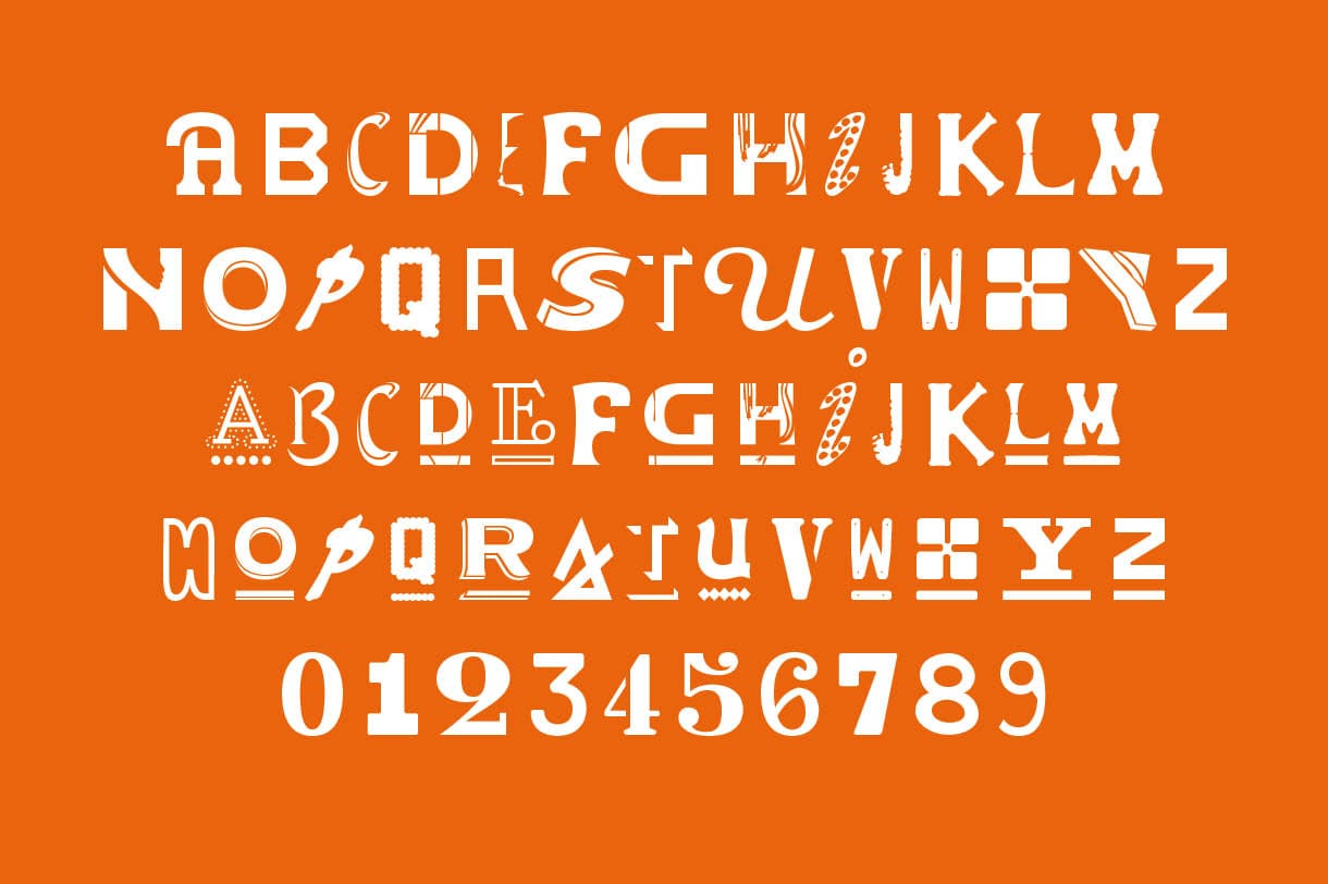
Free and usable by all
Sainté Mix is free: download it at the link below. You can use it in your personal or commercial documents. You can promote it by reproducing this download link. You can not, however, distribute yourself, or change it. For more details see the license.
Achieved in a few days and in a collaborative context, Sainté Mix was not developed to professional standards. It has nevertheless personality and can serve as a fun and unique display font!
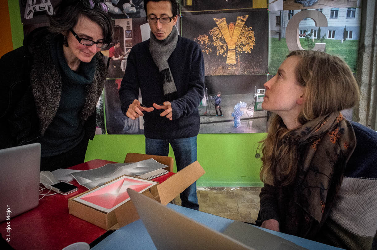
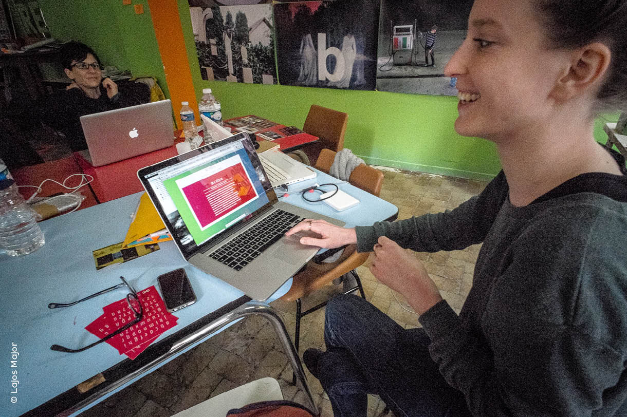
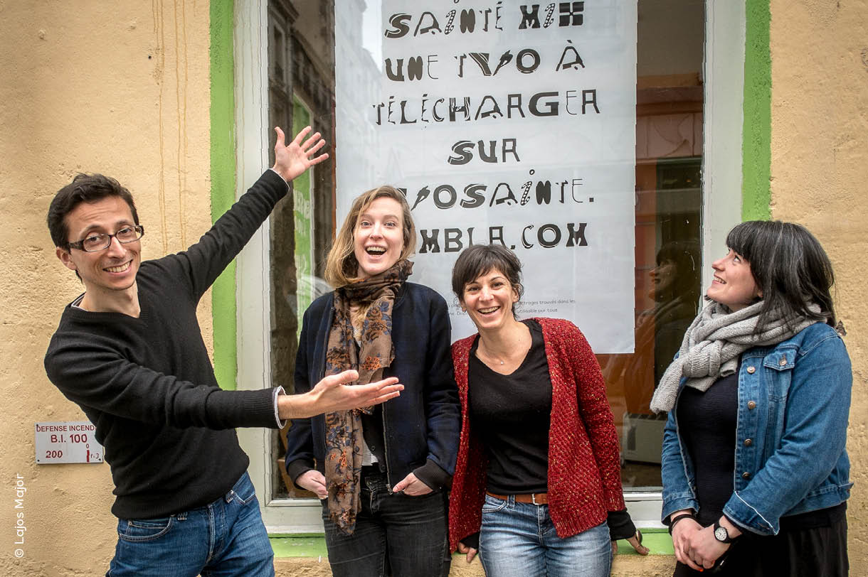
A big thank you to all those who participated in any way in this workshop, especially to Merry Lau, Élise Manchon and Marie Piccolin (end picture) for their investment and their assistance in the digitization process. And a friendly hello to Lajos Major I had invited to propose another type workshop parallel to ours, and who is the author of most of the photos that accompany this article.
Comments


